
TROA Resources Web App
I was tasked with redesigning the mental health resources app to help The Realms of Asgard’s community members — especially veterans and gamers — find crisis support faster when they need it most. Following the redesign, the urgency-based IA achieved 70.5% task success compared to 54.3% for the geography-based structure, significantly improving resource discoverability.

Overview
Mental health resources can be life-saving — but only if people can find them when it matters most. The Realms of Asgard's (TROA) existing resources page made that harder than it should be, with an unclear information architecture that buried critical support behind unintuitive navigation.
As the sole UX/UI Designer, I led this project end-to-end: from discovery and stakeholder interviews through IA research, tree testing, wireframing, and UI design. Usability testing is currently in progress.
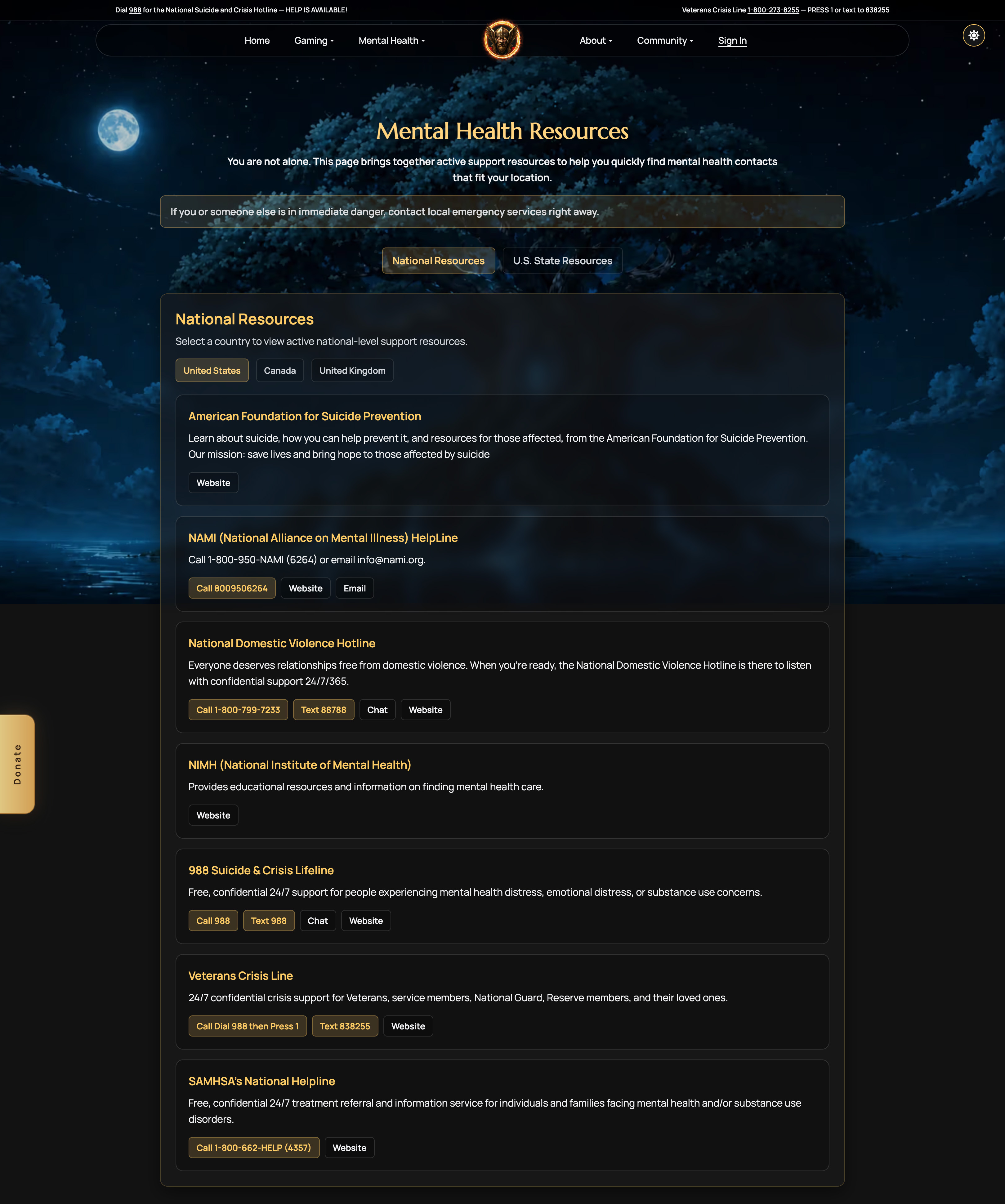
Heuristic Evaluation
To assess the current state of the experience, I conducted a heuristic evaluation of the existing Resources app. Below are a few key issues identified.
Problem Statement
Interviews with the CEO and the Chief of Mental Health revealed the following issues with the current resource page.
- Users have no efficient way to find relevant resources.
The current structure requires browsing, and resources are labeled with organization names. Users who know what they need — e.g., a veteran in Alabama looking for PTSD support — have no way to search or filter to relevant results quickly. - The U.S. state resources section is incomplete and not yet viable.
The infrastructure to support state-level resources (LLM-assisted content generation and link validation) hasn't been built. Publishing the section now requires heavy manual effort and risks surfacing broken or irrelevant links. - TROA’s own programs are not clearly connected to the resources page.
First Contact, Echoes of the 22, and Pathways to Healing are the core support TROA provides as a mental health organization, yet they are not incorporated into the resources page.
Technical Constrains
A conversation with the developer revealed the following technical constraints.
The page depends on infrastructure that doesn't yet exist.
The long-term vision of the database-driven architecture for managing and validating resources programmatically requires a large development lift. Until it's built, content must be managed manually, limiting how frequently the page can be updated and how confidently U.S. state content can be expanded.
Information Architecture
The heuristic evaluation and stakeholder interviews revealed a critical gap — crisis support wasn’t surfaced prominently. For a user in crisis, seconds matter. Recognizing that users search differently under stress shaped the new IA’s organizing principle: urgency vs. exploration — alongside bringing TROA’s own programs front and center.
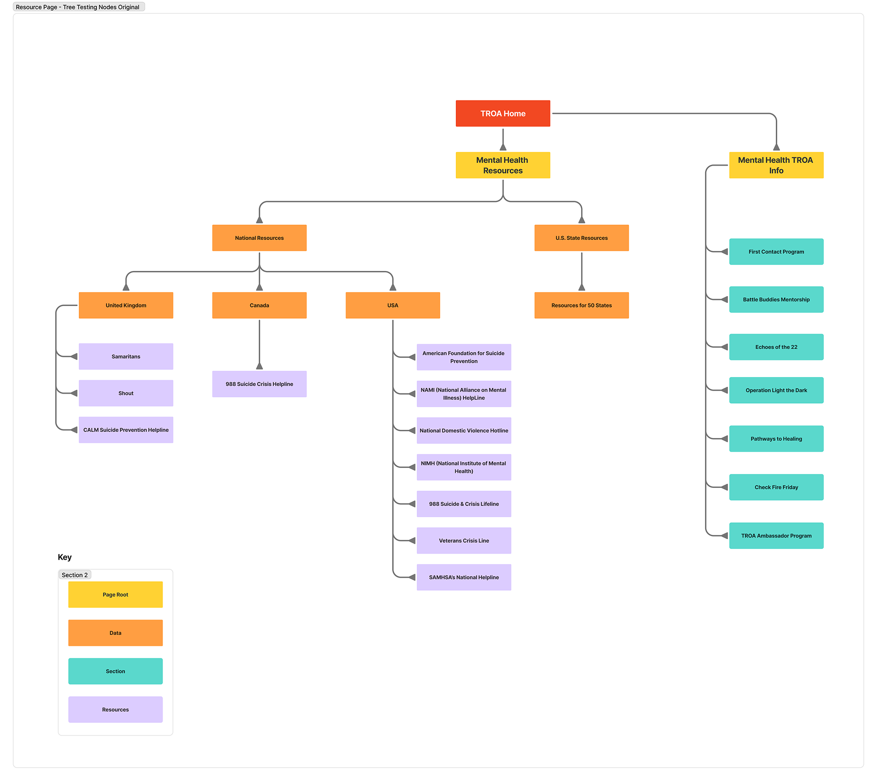

Tree Tests
Assumption
Urgency based structure is a more intuitive primary organizing principle than geography for this audience — users don't think "is this a national or state resource?" they think "how quickly do I need help?"
To validate this assumption, I tested both the original and redesigned IA using tree testing, comparing results across the two versions. Each version was tested with 10 participants to surface patterns and identify where users succeeded or struggled.
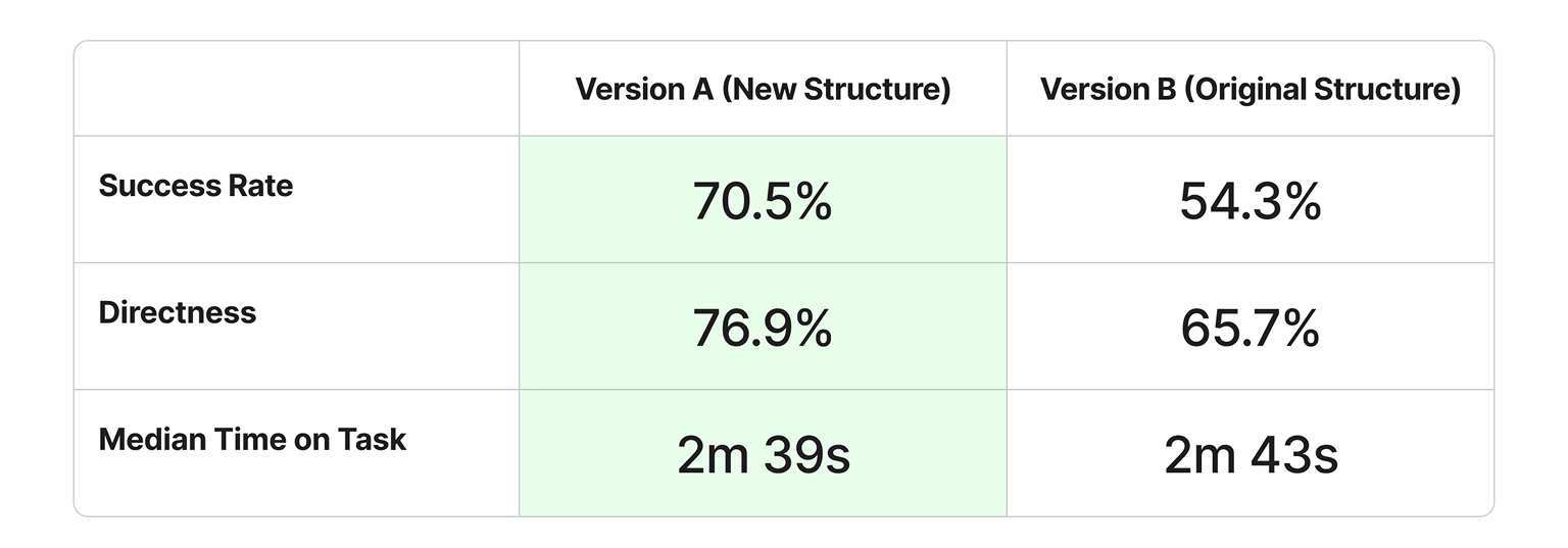

Revised IA
Two tasks in Version A surfaced specific labeling and structural issues that I have since addressed:
Task 3: Find depression resources when struggling with mood and motivation
Users were confused by the node "Mental Health Navigation," incorrectly assuming it covered depression-related content. So, I relabeled it "Mental Health Support Lines" to more accurately reflect its purpose as a peer-support hotline directory, while keeping the "Depression" node as a separate entry pointing to the depression-specific resource page.
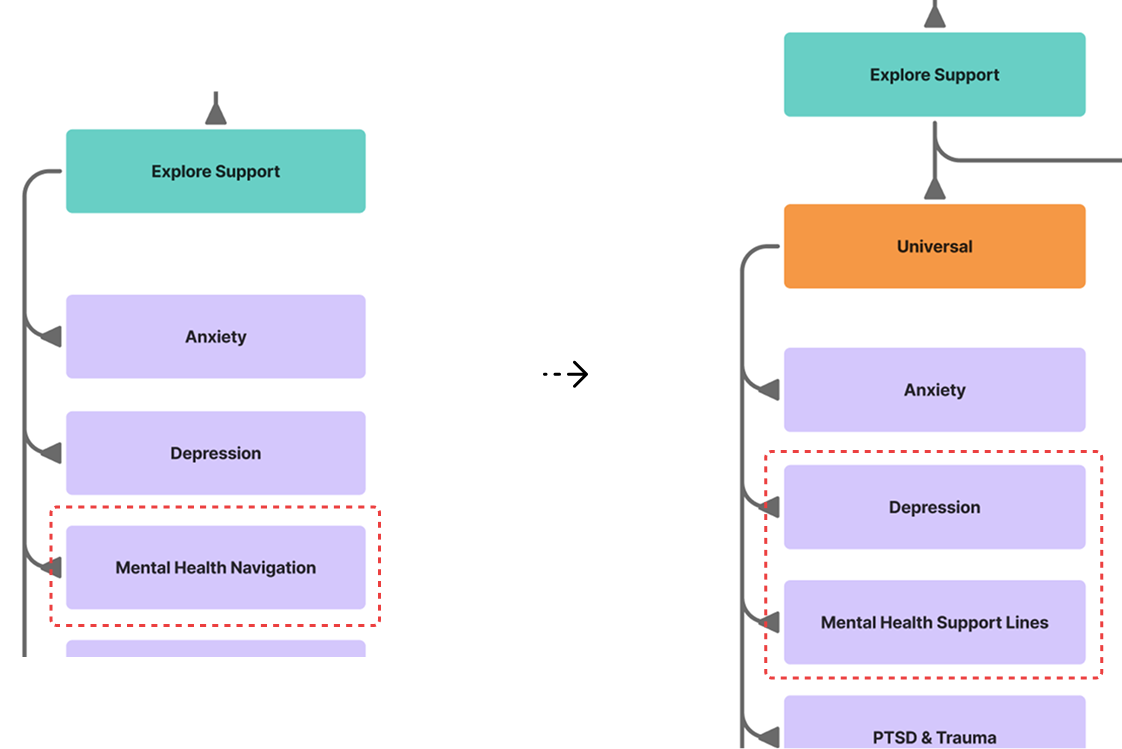
Task 6: Find support for family members of veterans struggling with mental health
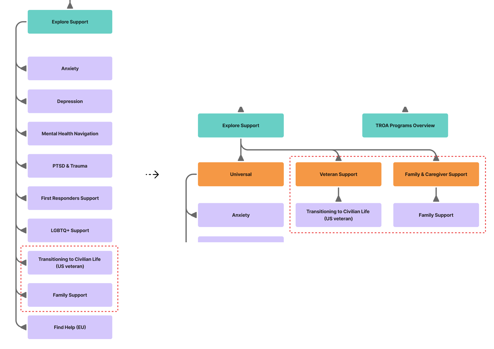
Most users focused on veteran mental health rather than family support, revealing that the structure did not adequately distinguish between resources for veterans and resources for their families. To address this, I separated veteran support from family and caregiver support into distinct groupings, with resources such as transitioning to civilian life housed under veteran support.
Ideate
Three business goals shaped the redesign, each mapped to a specific user need and design response.
The following wireframes illustrate the design solutions to the identified business goals and user needs.

- "Get Help Now" is designed for users who need immediate assistance. The region tab is automatically selected based on the user’s IP address to surface the most relevant resources.
- "Explore Support" is designed for users who prefer to browse for resources. Content is organized by user type, with region and topic filters to support quick discovery.

- U.S. state-level resources are currently hidden to reduce manual content generation and maintenance overhead.
- Once the automated content generation and link validation system is fully implemented, U.S. state-level resources will be reintroduced.

- Veteran and family & caregiver resources are separated into distinct categories, making them easier to find without browsing the general category.

- A TROA Programs Overview section is included to surface and promote the organization’s own programs alongside external resources.
Mobile View
The layout is adapted for mobile, prioritizing thumb-friendly interactions and native mobile conventions.

Wireframe (Left)
- Navigation tabs scroll horizontally on mobile rather than stacking, following established mobile patterns and preserving usability.
- Phone numbers are hidden in favor of tap-to-call buttons, keeping the interaction clean and familiar on mobile.
- A floating "To Top" button is anchored to the bottom-right corner of the screen at all times, allowing users to return to the top without scrolling back up.
Wireframe (Right)
- The navigation tabs and filters within Explore Support remain sticky on mobile, staying visible as users browse so they don't lose track of their selected filters.
Interactive Prototype
The Figma wireframes were converted into an HTML prototype using Figma MCP + Claude to efficiently support complex filter interactions and dynamic states. This approach enabled faster iteration, more realistic testing conditions, and a single prototype that worked across desktop and mobile devices.
