
TROA LMS
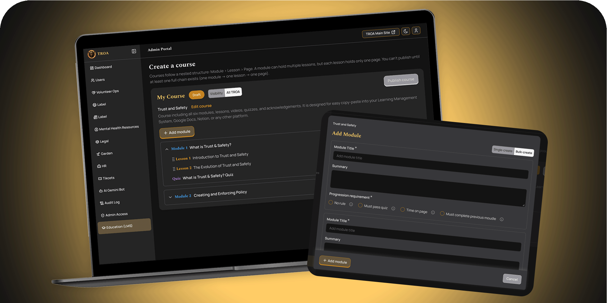
TROA needed a learning management system to deliver training – like peer support training to prepare volunteers to support people with mental health challenges. But the existing LMS had been built quickly by a developer without strategic design input, making it difficult for course creators to actually use.
Background
When I started this project, I worked alongside another UX/UI designer for two weeks until she left the organization. Over the following two months, I worked as the solo designer, collaborating with a developer and leading the design end-to-end.
Action
Heuristic Evaluation
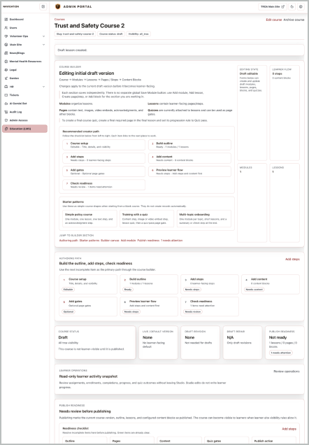
Initially, the developer asked me to QA the platform, but I saw an opportunity to go further – to actually diagnose and fix the underlying usability problems. To surface the current issues, I conducted a Nielsen's 10 Heuristics evaluation of the existing LMS alongside a fellow designer. Below are a few of the findings.
Buy-in to Redesign
Based on the evaluation findings, I distilled the key insights into plain language stakeholders could easily understand, paired with real examples from the platform. This helped me secure buy-in to redesign the platform.
Scope constraint: UI-only changes for this – updates requiring database changes were deferred to a later release.
Redesign
My redesign focused on addressing the usability issues surfaced by the heuristic evaluation, while fixing the core UI issue: the single-screen design packed the entire course-creation flow into one long, heavy page.
Smaller, Focused Steps
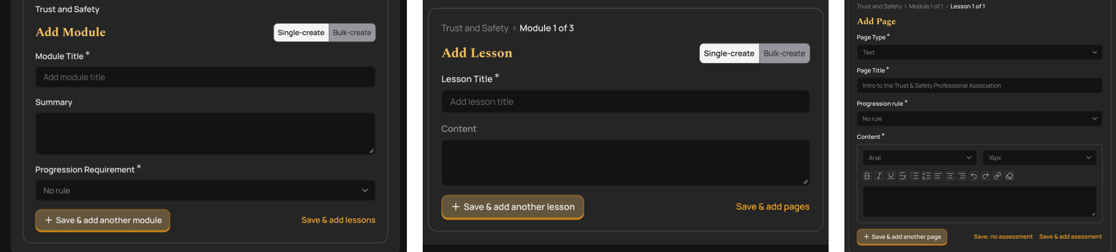
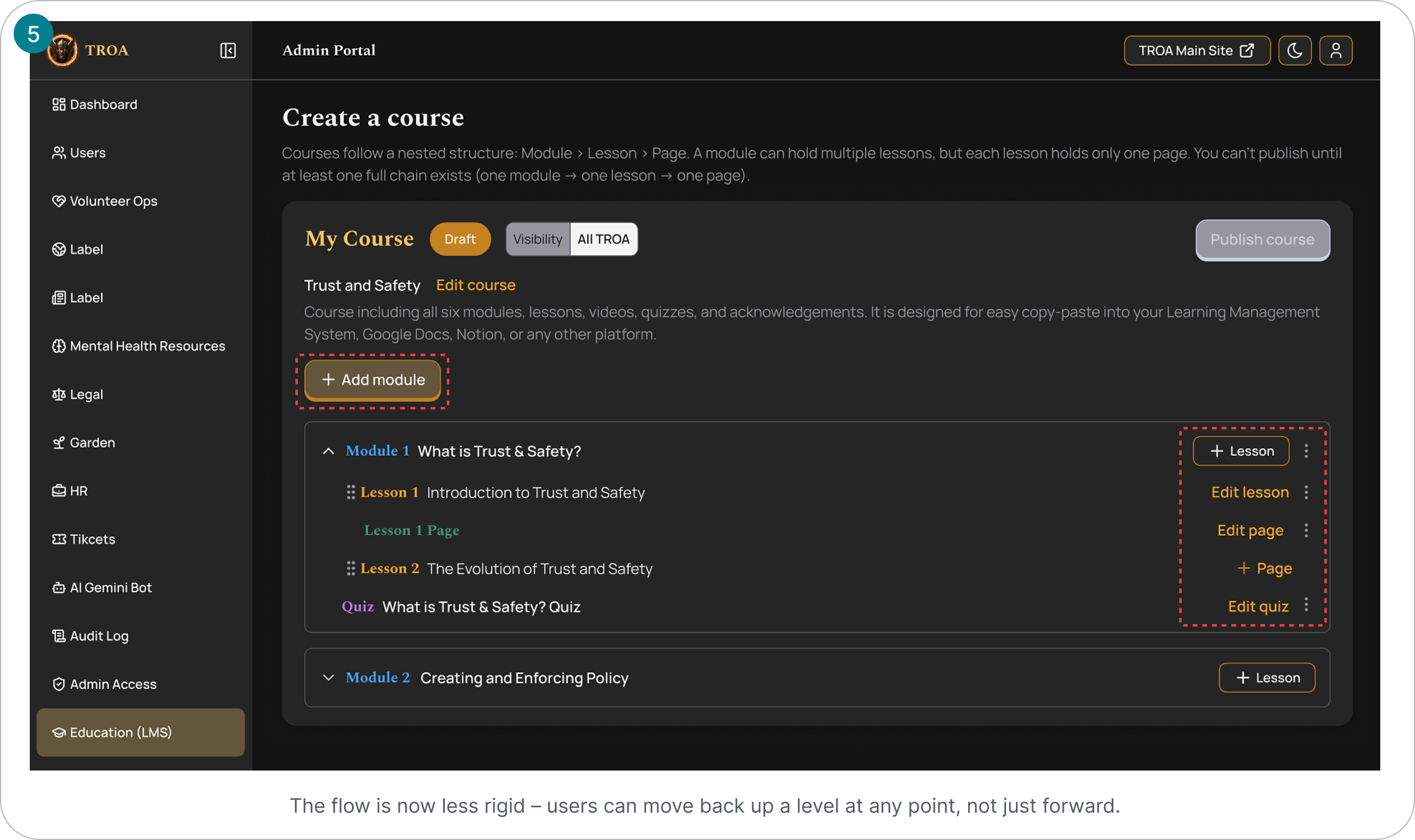
I broke the flow into smaller, focused steps aligned to the existing hierarchy – Course > Module > Lesson > Page > Content Block – which let me cut most of the explanatory text the original page needed to orient users.
UI Alignment with the Public-Facing Website
Beyond usability, the developer also wanted the product UI to feel cohesive with our public website. So, I built a scalable, token-based design system to serve both, then used it to build the high-fidelity mockups – adding variables that let the UI switch between light and dark mode instantly

Usability Testing
Using a clickable prototype I built with Figma MCP and Claude, I tested the new design solutions with 5 internal volunteers who represent future users of the platform.
Hypotheses & Results
Nesting a child item
We believe users will nest a child item into a parent (e.g., add a lesson inside a module) without guidance, because the child-level add action is visually distinct from the sibling-level add action (hyperlink vs. button) and its label clearly states what it does. We'll know this is true if 80%+ of participants correctly nest the item (not create it as a sibling) without asking for help.
Result: 3/5 completed unassisted. 1/5 completed with difficulty (unassisted). 1/5 completed (prompted).
Bulk creation
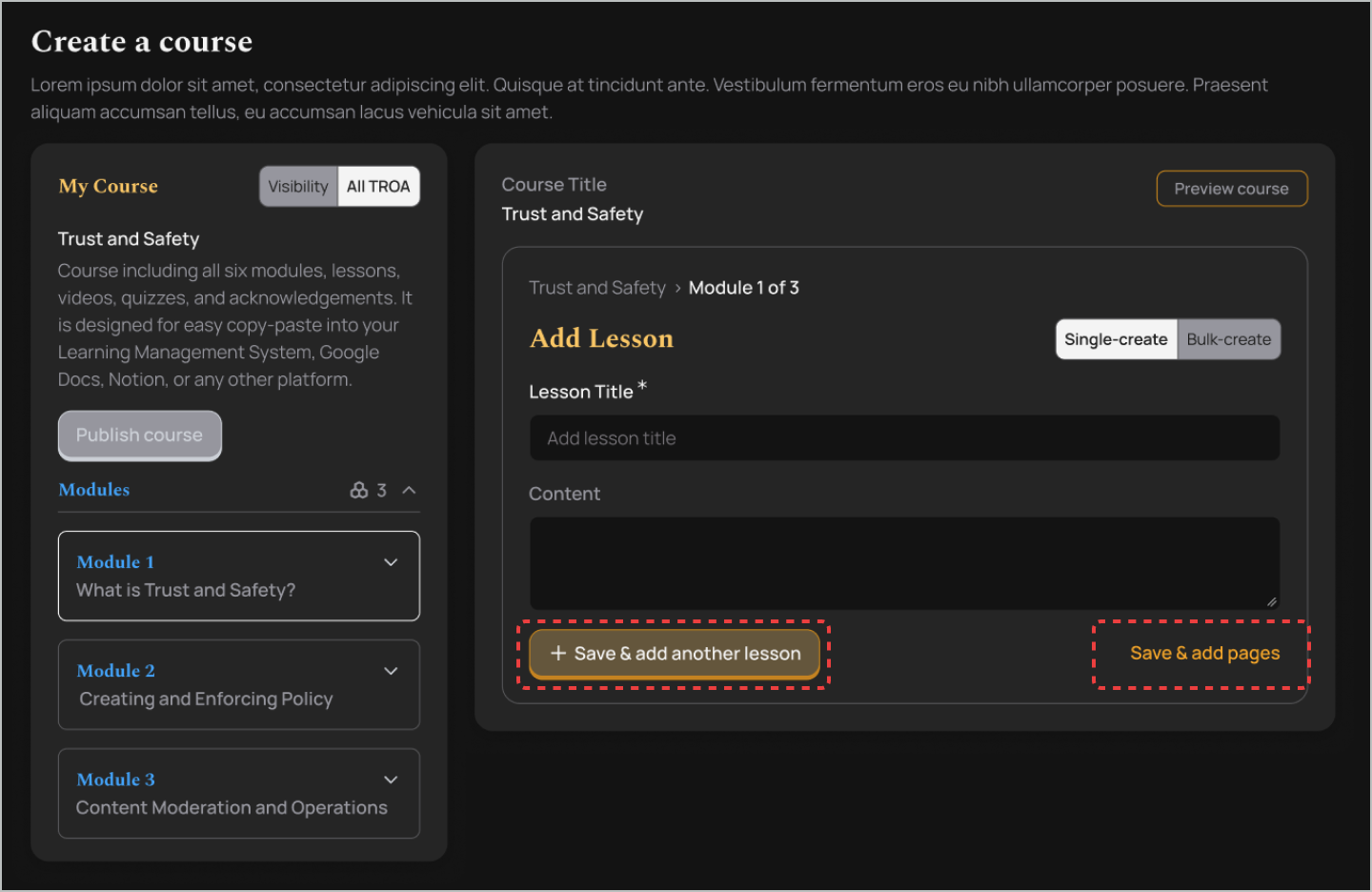
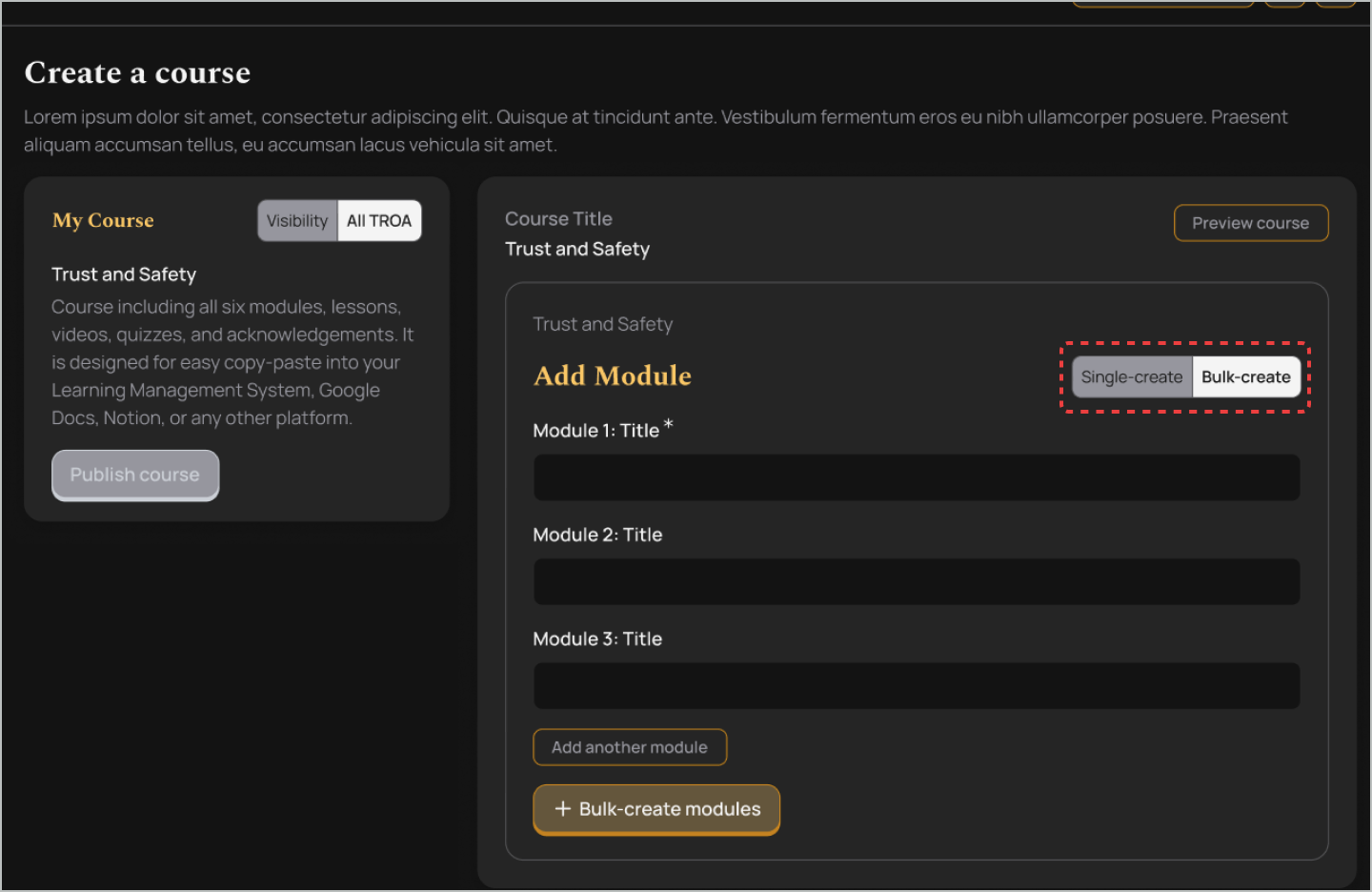
We believe users will discover and use bulk module creation instead of adding modules one at a time, because the bulk-add action is prominent - placed at the top of the creation screen and visually distinct from the single-add action. We'll know this is true if 80%+ of participants use bulk creation when the task implies multiple modules (e.g., "add 5 modules"), without prompting.
Result: 5/5 completed unassisted.
Progression requirement
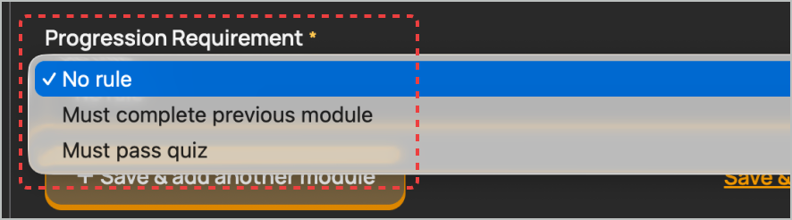
We believe users will understand what the Progression Requirement dropdown controls and correctly set a rule, because the dropdown label and options use plain-language descriptions rather than technical terms. We'll know this is true if 80%+ of participants correctly explain what the rule they selected will do, in their own words, without asking for help.
Result: 5/5 participants understood what the Progression Requirement mean but all of the participants were confused about the options.
Delete
We believe users will correctly locate the delete action for modules, lessons, and pages without guidance, because the delete icon/label is consistent across all three content types. We'll know this is true if 80%+ of participants complete the task without asking for help.
Result: 5/5 completed without assistance

Edit
We believe users will locate and complete an edit action for modules, lessons, and pages without guidance, because the edit icon/label is consistent across all three content types and matches the delete icon's positioning convention. We'll know this is true if 80%+ of participants complete the task without asking for help.
Result: 5/5 completed without assistance but 1 participant mentioned some confusion.

Synthesis with Claude
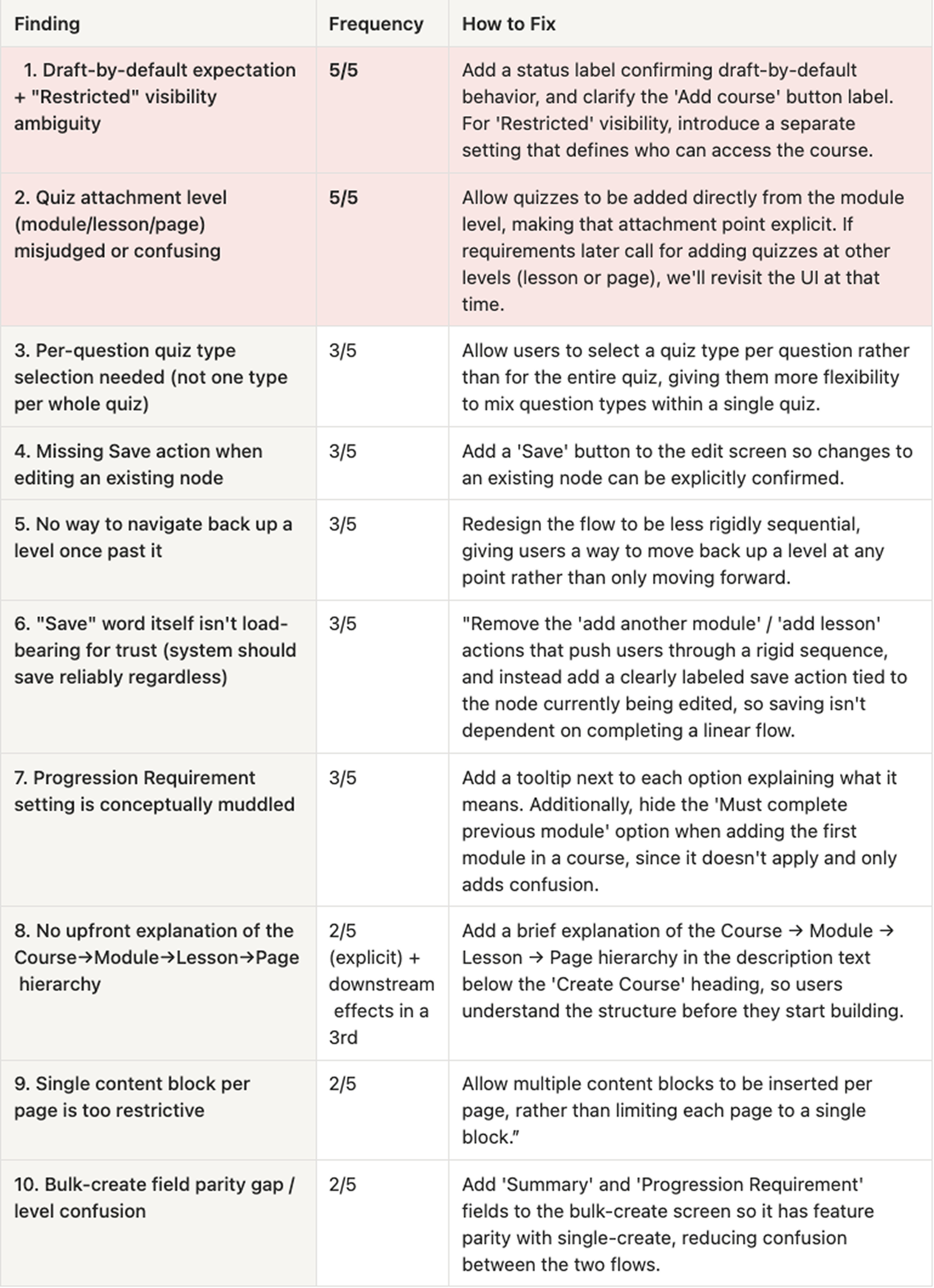
To speed up synthesis, I prompted Claude to build the affinity clusters from detailed notes I took while debriefing each session, then asked it to rank the findings by frequency – strongest evidence first.
Redesign
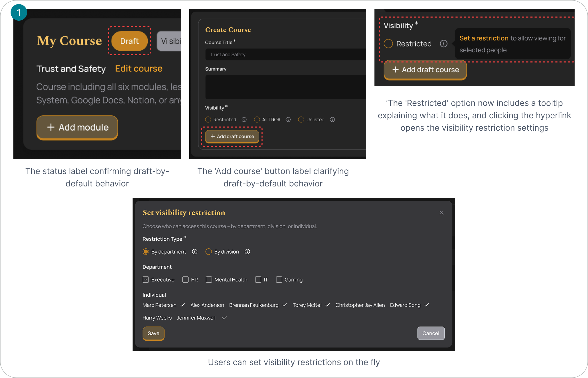
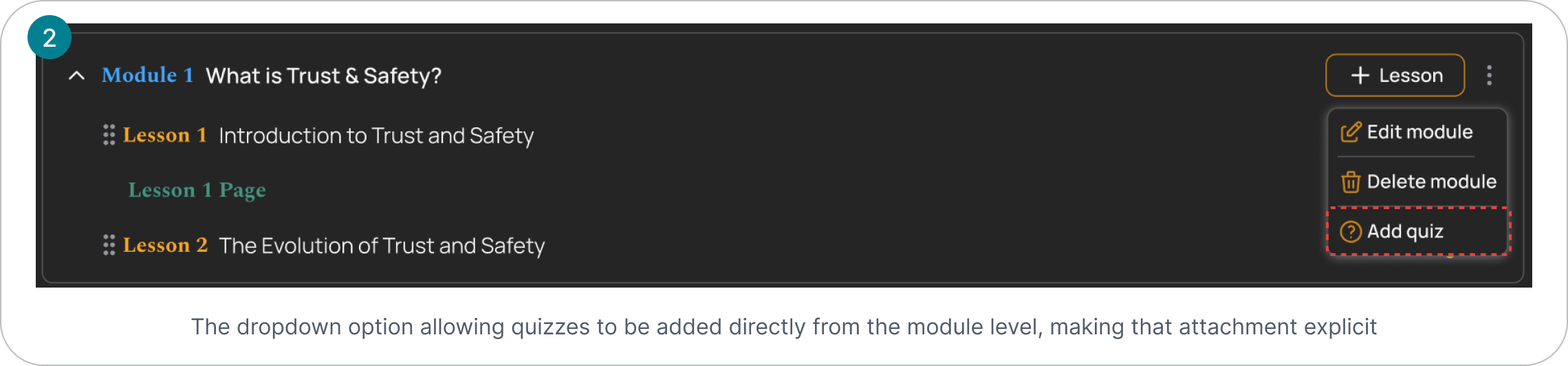
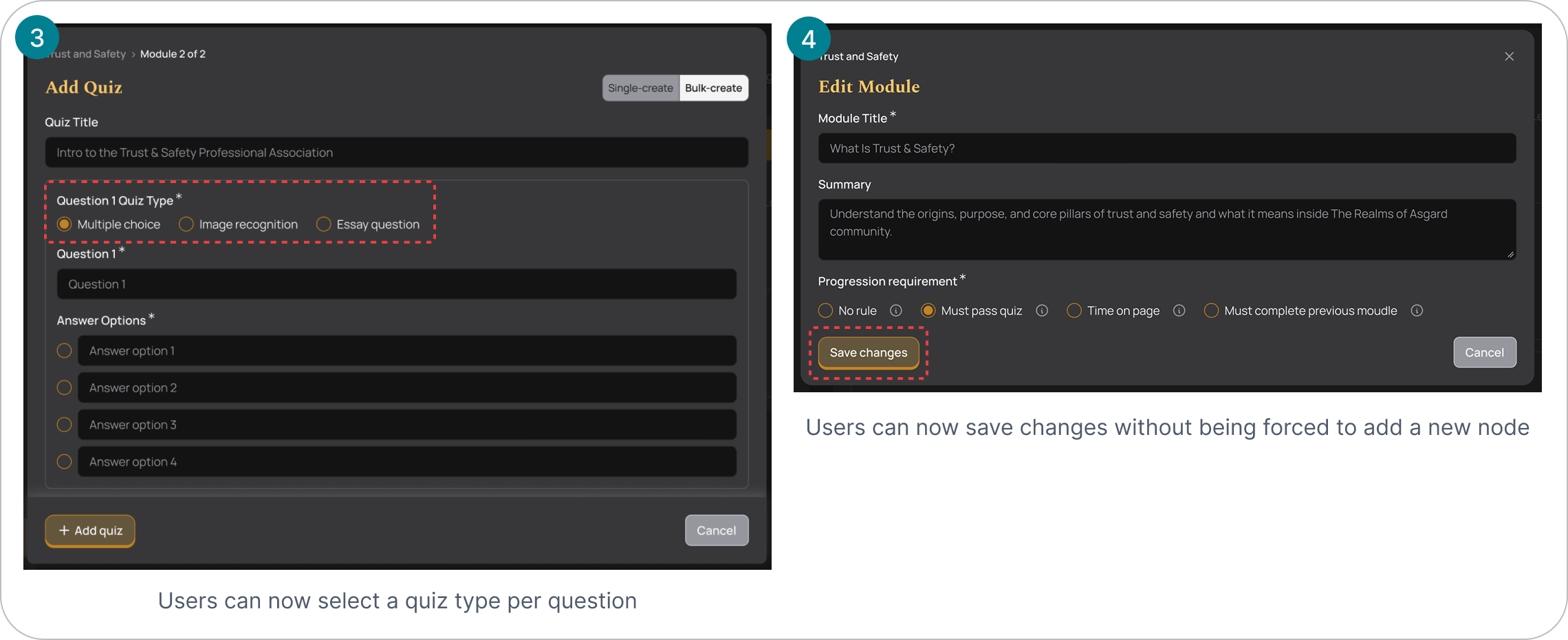
Shown below are the top 5 fixes, ranked by evidence strength – see the full findings table above for all 10.
Impact
While a second round of usability testing hasn't been conducted yet, the redesign directly resolves the two findings confirmed by all 5 participants — draft-by-default expectations and quiz attachment confusion — along with 8 additional evidenced issues. It also replaces the original single, dense page with a step-by-step flow broken across the course hierarchy.
80% fewer creation steps for content-heavy courses. For a course like Peer Support Training (10 modules, ~5 lessons each), the original flow required 60 separate create-and-submit actions. Bulk-create collapses this to 11 — one screen to create all 10 modules, and one per module for its 5 lessons — without losing any per-item detail like title or summary.
What’s next?
This redesign addresses the two most consequential findings from testing (confirmed by all 5 participants) along with the next three most-evidenced issues. A few things remain open:
- Test the redesign. Run another round of user sessions to confirm the fixes actually work.
- Fix the rest. One more issues from testing are documented but not yet designed.
- Add more content options. Users asked for audio and table blocks, more quiz question types, and a way to bulk-import content from tools like Google Sheets.
- Support life after course creation. Add a dashboard to track who's completed a course, plus automated reminders for due dates.
