Multi-Invoice Form
Designing a multi-invoice web form to accelerate the invoice workflow by enabling users to settle multiple invoices at once, optimized for both desktop and responsive layouts.
Overview
The multi-invoice web form is a crucial component of the invoice flow — the process halts when customers can’t pay. Building on the existing single-invoice form, this new version lets users pay multiple invoices at once by opening the form via a link in their email, offering greater convenience and efficiency.
As the solo UX/UI Designer, I led this project end to end while collaborating with the designer overseeing the single-invoice form redesign to ensure consistency in UI and language. I collected feedback from the UX team and stakeholders to align the form with business goals. I also iterated on the responsive layout through usability testing, ensuring it performed smoothly on mobile devices.
The challenge
Problem
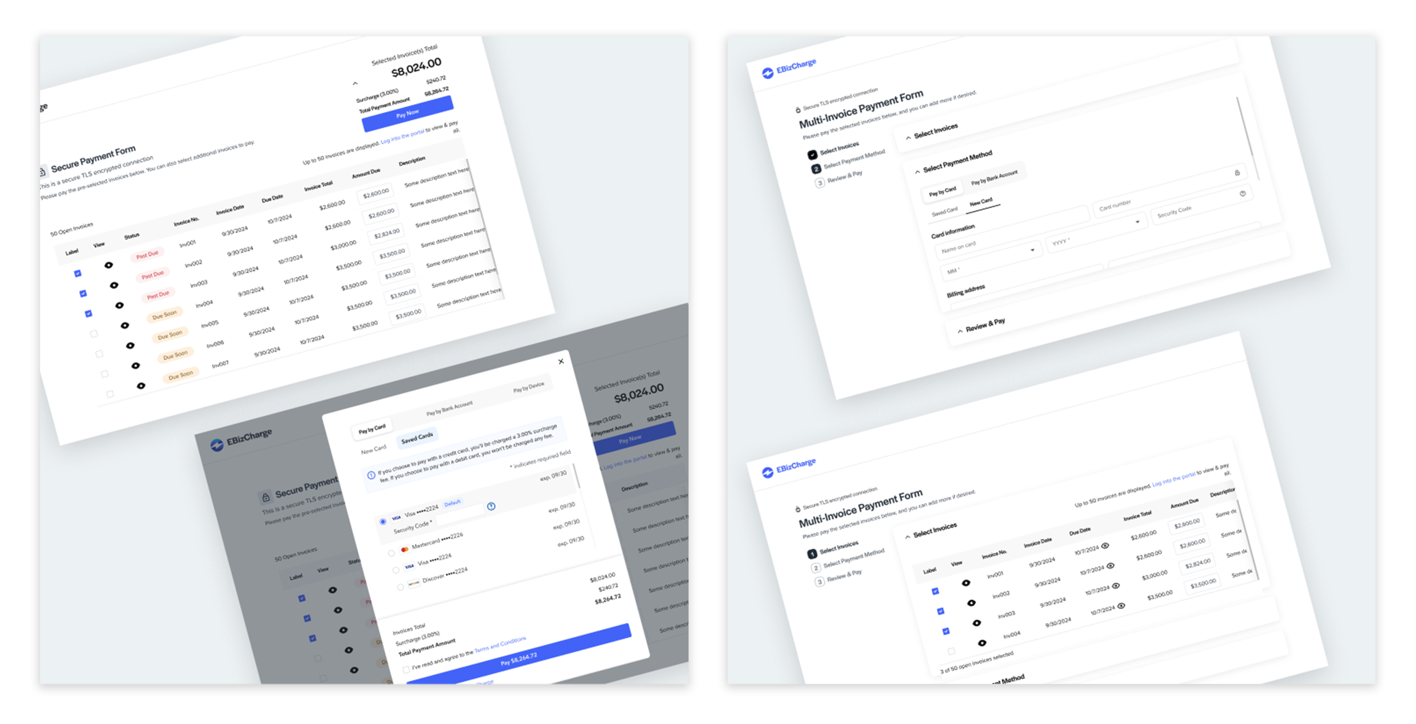
The previously designed multi-invoice payment form lacked usability because it mirrored our desktop payment section rather than being optimized for web form flows. With the company’s rebranding underway, the form also needed a visual refresh to align with the new brand identity.
Stakeholder Goals
- Enable the convenient submission of payments for multiple invoices simultaneously.
- Streamline the payment process by allowing users to settle multiple invoices at once.
- Align the form UI with the new brand identity.
User Pain Points
These user insights are based on informed assumptions drawn from online research.
- Time-consuming manual payments
Paying multiple invoices individually is labor-intensive and inefficient. - High credit card processing fee
Processing multiple transactions results in higher credit card fees. - Unoptimized form usability
The current form lacks intuitive design, hindering smooth user interactions.
Action
Competitive Analysis, Design System, & UI Exploration
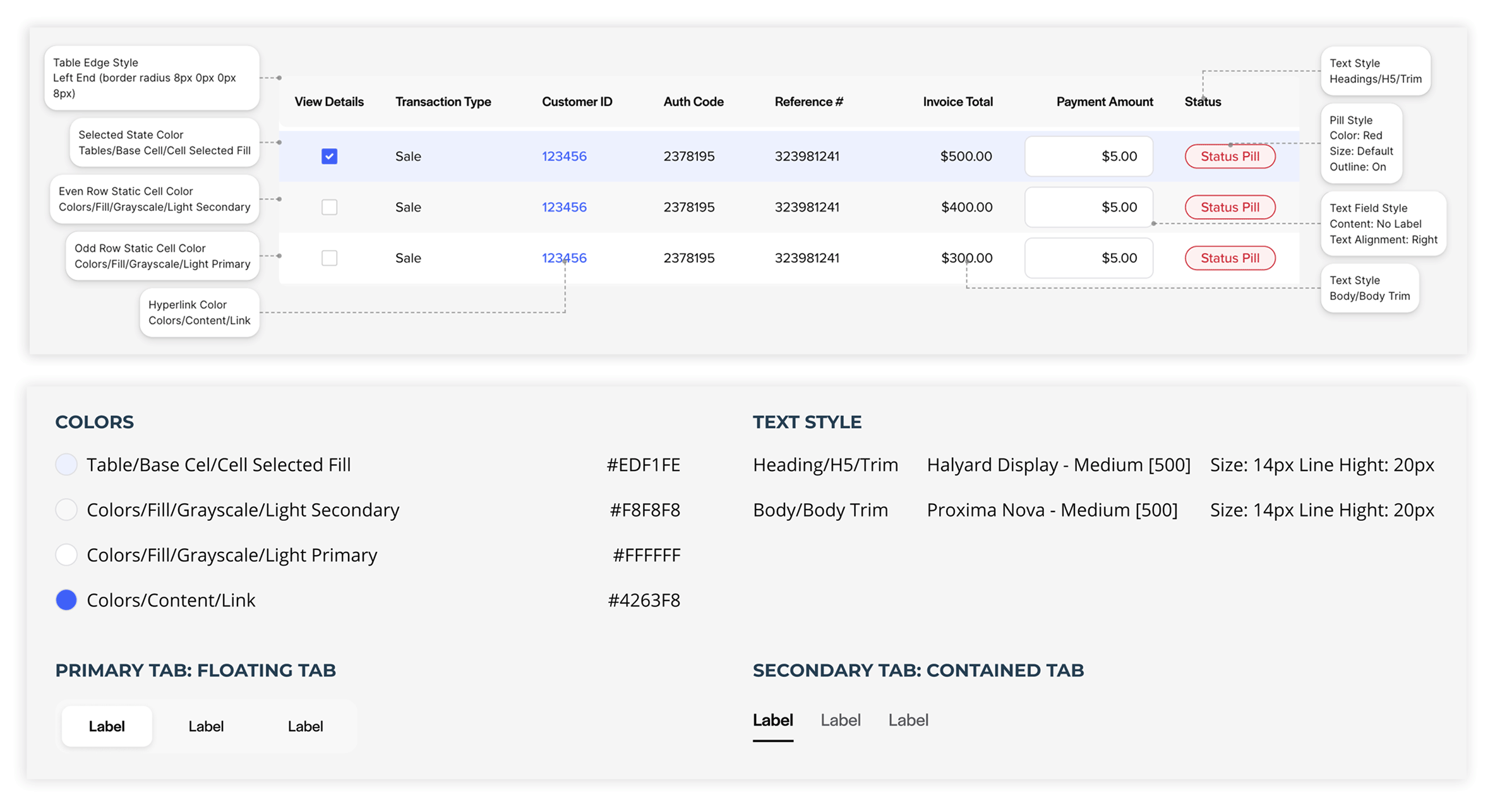
I conducted a competitive analysis of payment forms to identify effective UI patterns. Leveraging our updated design system, I iterated on various layouts and workflows to enhance usability.
Ideate
I explored workflows ranging from rigid to fluid where rigid workflows guide users through a defined, step-by-step process, and fluid workflows offer a more flexible path, allowing users to navigate freely to complete tasks.
Iterating Designs
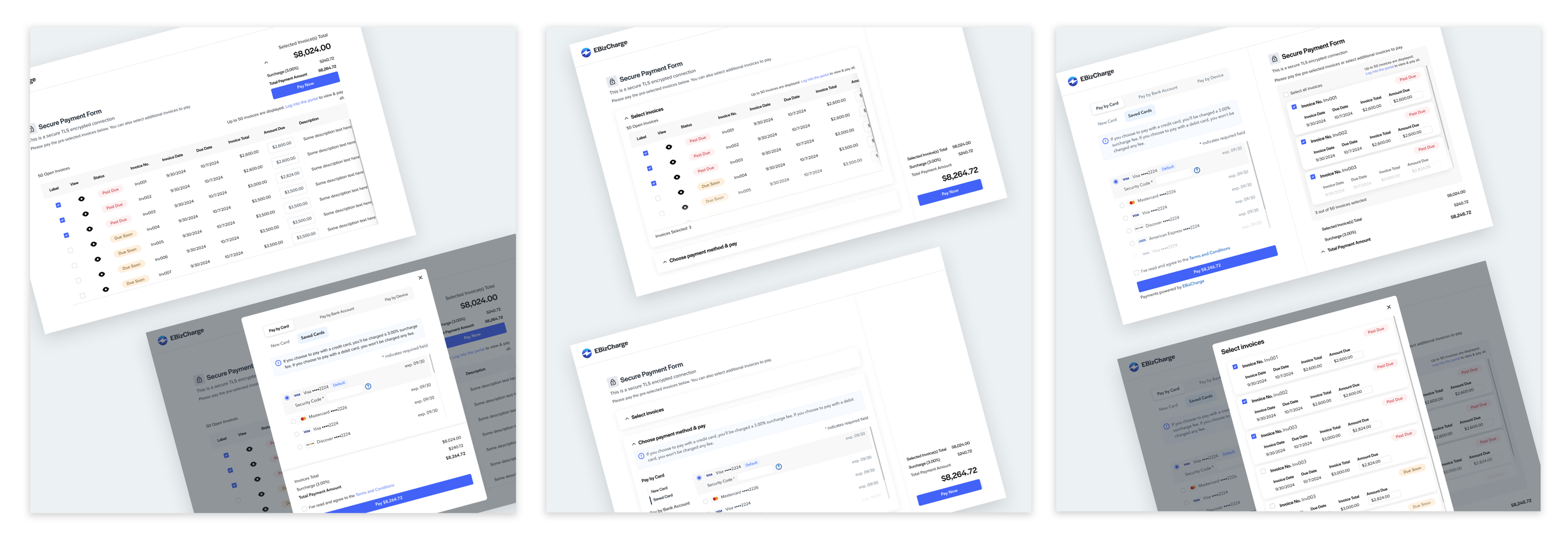
In a UX team review session, I presented five design concepts. The feedback was positive, with two designs selected for further exploration based on their potential to enhance the user experience. In the end, the team chose the fluid workflow option, where the invoice table and payment methods are placed side by side for greater convenience in selecting invoices and a payment method.
Enhancing Table Usability and Surcharge Visibility
Presenting the final design to the VP of Product Development highlighted the need to reduce table columns to prevent cumbersome horizontal scrolling. Introducing horizontal scrolling alongside vertical scrolling negatively impacts usability. Additionally, the CTO emphasized making the surcharge information more prominent.
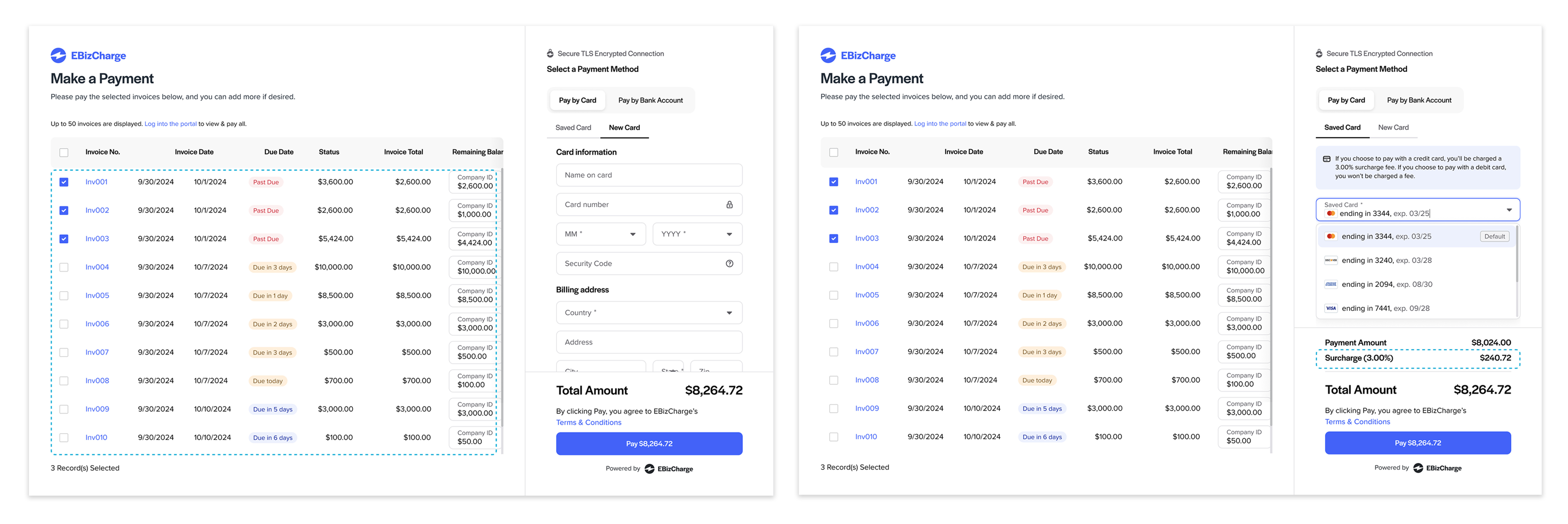
Reflecting on the feedback received, I removed the "Invoice Date" column since it was less critical than the "Due Date," which helped eliminate horizontal scrolling. For the "Surcharge" visibility, after testing different layouts and UI elements in the single-invoice form, we decided to retain the existing multi-invoice design, as it already provided strong readability and supported quick scanning. We then aligned the single-invoice layout accordingly for consistency.
Mobile Layout Optimization
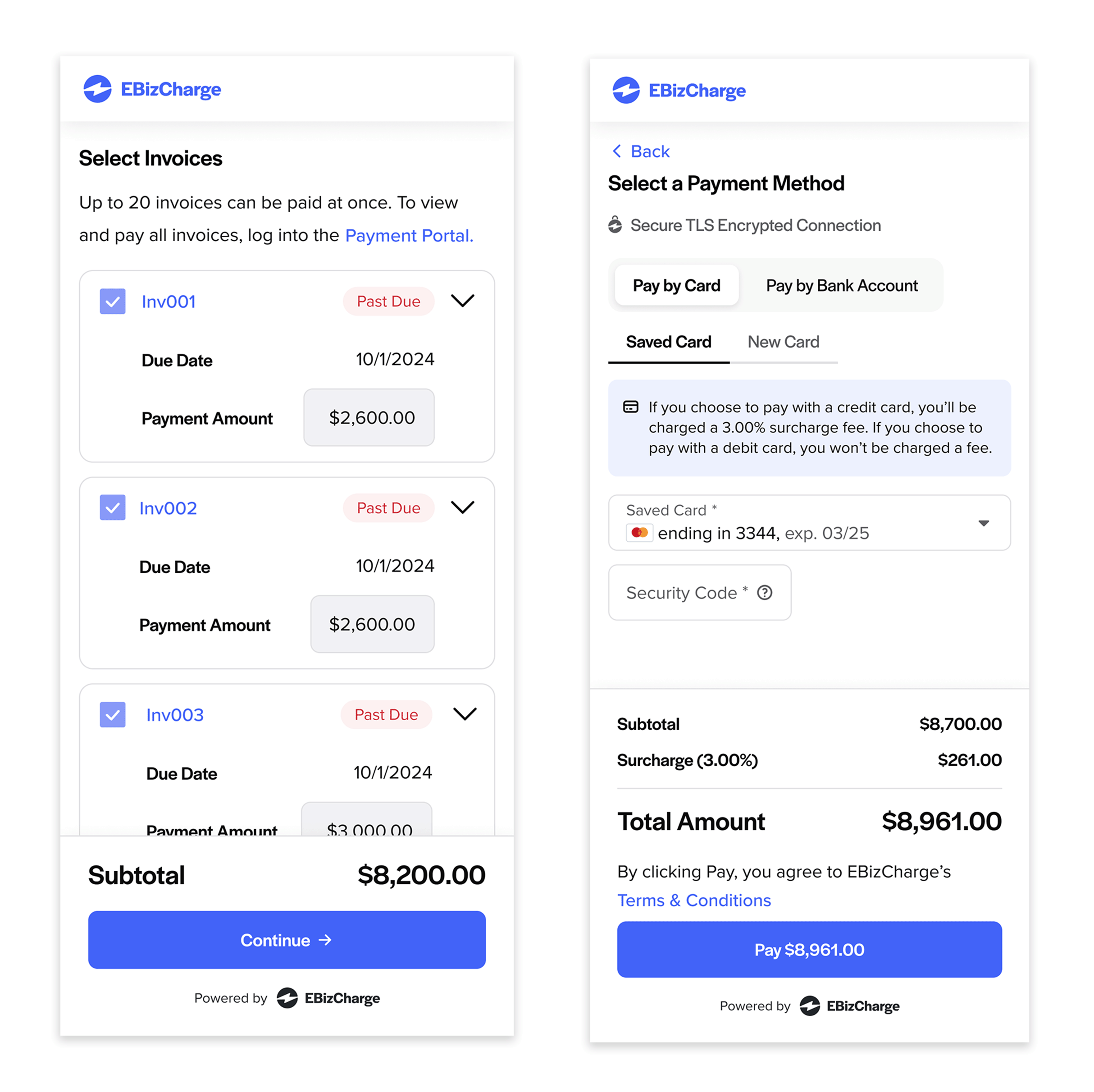
To address the challenges of adapting a content-heavy desktop form to a mobile-responsive layout, I employed a creative approach to maintain simplicity and intuitiveness.
I transformed the invoice table into multiple cards, each displaying a single piece of invoice information. This not only improved readability but also provided a more organized presentation.
Implementing a collapsible design, each card initially displays only essential information. A chevron icon allows users to expand and view additional details, enhancing quick scanning and maintaining a clean interface.
Additionally, I restructured the user flow into a step-by-step process, aligning with mobile users' familiarity with sequential task completion. This adjustment streamlined the experience and made the payment process more intuitive.
Mobile Layout Usability Testing
To ensure the usability of the responsive layout, my fellow designer and I conducted testing with the Support team, leveraging their direct experience with customer interactions and their insights into user needs using the prototype built in Figma.
We focused on evaluating the following aspects:
- Visibility of critical information (e.g., Invoice Total, Remaining Balance)
- Ease of adjusting payment amounts
- Efficiency in selecting preferred payment methods
- Clarity of payment details
- Ability to send email receipts post-transaction
Usability testing revealed two key improvements:
- Terminology Update
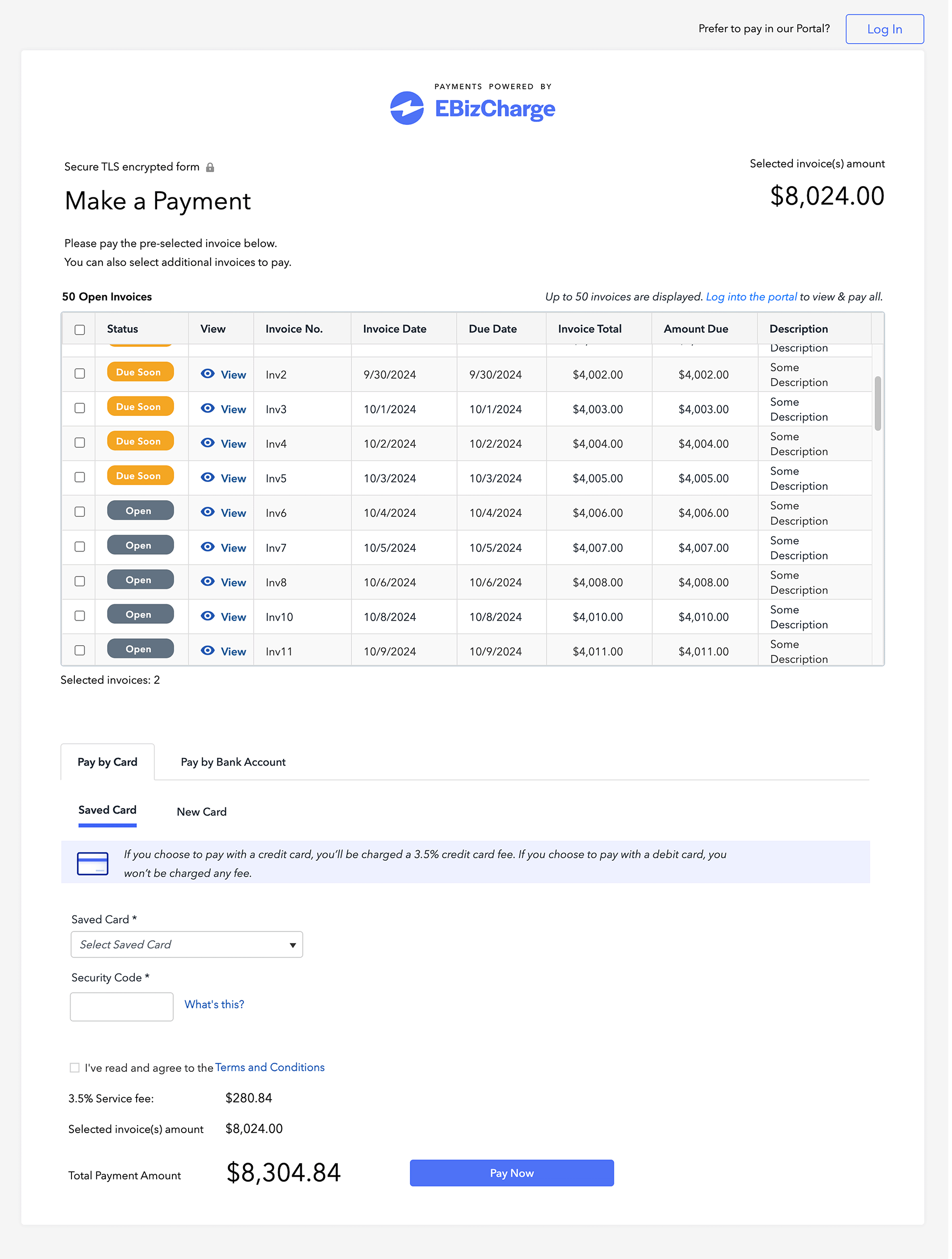
The support team noted that the term “Payment Amount” under payment methods was unclear and potentially misleading, especially when placed next to another field labeled “Total Amount.” Based on their familiarity with the terms users commonly use, they anticipated this label would cause confusion. So, we relabeled it as “Subtotal” to better reflect its purpose and aligned the layout - “Subtotal,” “Surcharge,” and “Total Amount” — in an equation-like format for clarity. - Enhanced Filtering
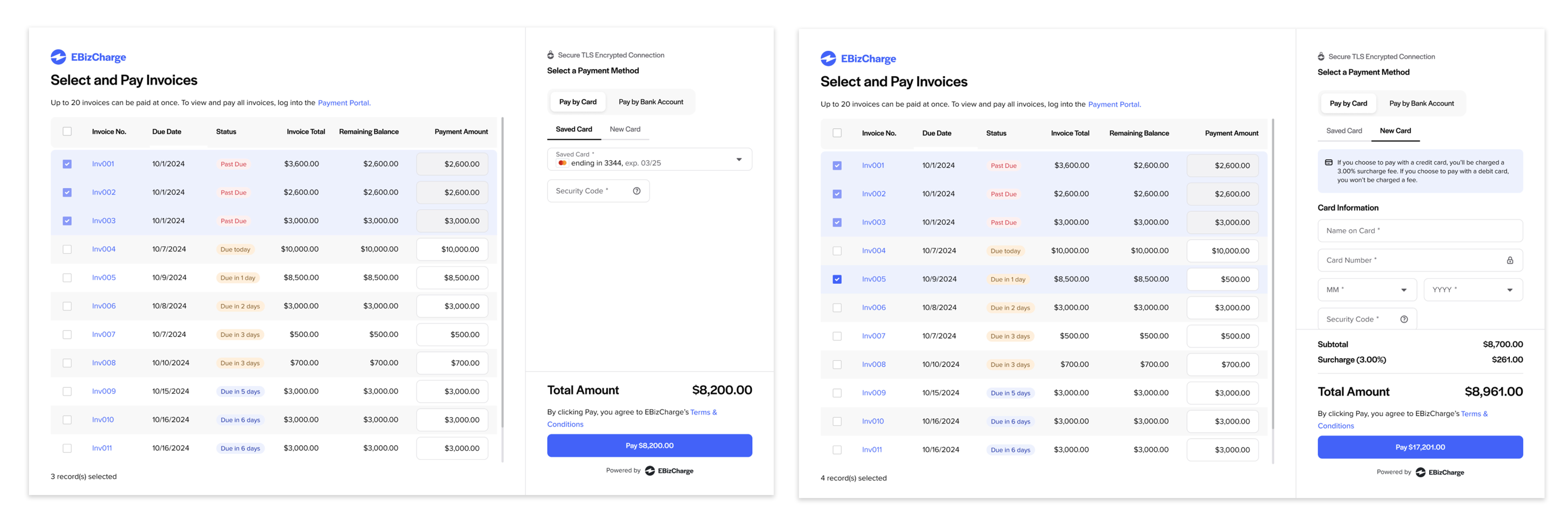
Initially, invoices were listed by creation date, which worked well for desktop due to its ample screen space and built-in sorting capabilities. However, on mobile devices with limited space and no ability to toggle between ascending or descending order, the Support team recommended adding a filtering option. Based on their understanding of customer needs, they anticipated that users would rely on filters to quickly find specific invoices.
In response to their feedback, we introduced filters by:
- Due Date (Oldest First)
- Payment Amount (Highest to Lowest)
- Invoice Number (Highest to Lowest)
Final Solution
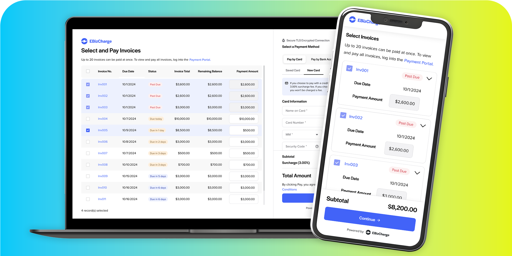
Desktop Layout
Improved Usability of Form
I optimized the form for web flow usability by placing the invoice table and payment method fields side by side. This lets users see and act on both without jumping across screens, improving efficiency.
Reduced Content Overload
By removing unnecessary columns and elements, I eliminated horizontal scrolling - crucial when users already need to scroll vertically to view all invoices.
Visual Design & Brand Consistency
I applied the updated design system to refresh the UI, aligning the form’s appearance with EBizCharge's new brand identity.
Responsive Layout
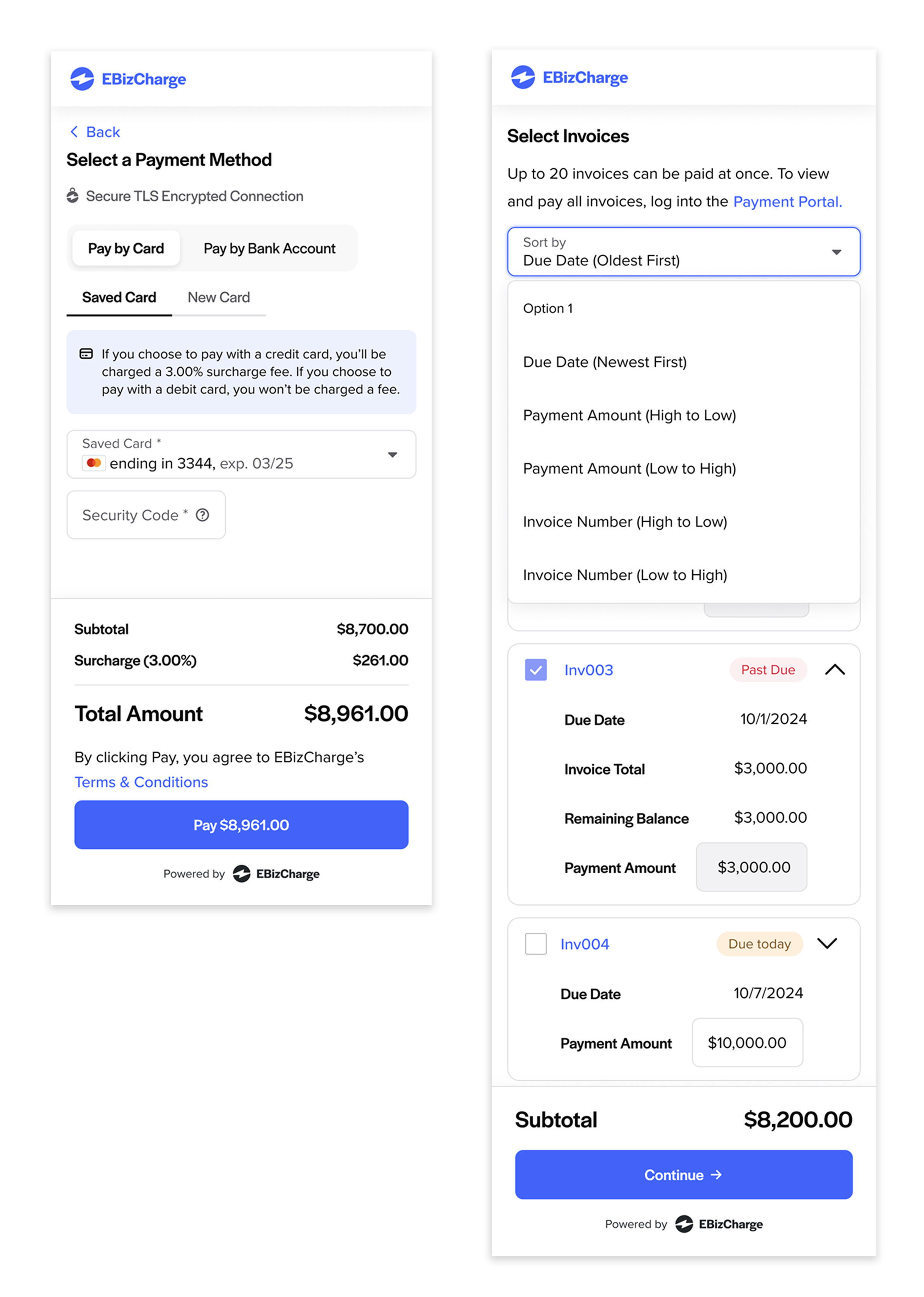
Improved Mobile Usability
I converted the invoice table into multiple cards, each showing a single piece of invoice information. This helped transform a content-heavy form into a mobile-friendly layout. Using collapsible cards that initially display only essential details—expandable via a chevron icon—supports quick scanning while keeping the interface clean.
Revised Terminology
By aligning labels with users’ mental models and clarifying language, I removed ambiguity from form content.
Enhanced Filtering
To overcome mobile layout limitations, I added additional filter options: sorting by Due Date (Oldest First), Payment Amount (Highest to Lowest), and Invoice Number (Highest to Lowest). These allowed users to find invoices more easily without needing extra screen space.
Retrospective
Incorporating diverse feedback can be challenging, but asking targeted questions helps clarify intent, align user needs with business goals, and streamline the design process by minimizing unnecessary revisions.
