Lunch Money Buddy App
Designing a mobile app that empowers busy parents and guardians to conveniently manage in-school lunch accounts — including adding funds, preordering meals, and more.
Overview
Lunch Money Buddy is a mobile app concept that lets parents and guardians of school-aged children manage in-school lunch accounts virtually. Its main goals are to allow easy management of lunch balances (avoiding negative balances) and to facilitate lunch ordering through the app.
As the UX/UI Designer on this project, I worked independently and also collaborated with other designers to exchange ideas and gather feedback throughout the process.
The challenge
Problem
Students with negative lunch account balances are often unable to purchase meals. Meanwhile, busy parents and guardians frequently struggle to plan ahead due to misplaced physical lunch menus or difficulty accessing digital versions.
Stakeholder Goals
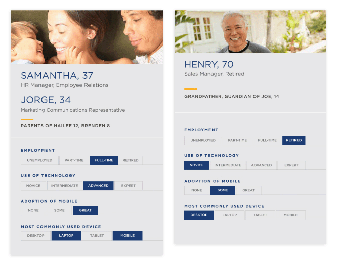
As this is a conceptual project, I established the company's goals based on online research and informed assumptions.
- Mitigate negative lunch account balances
- Assist parents and guardians in planning lunch arrangements in advance
- Increase lunch orders
User Pain Points
User insights are derived from online research and informed assumptions.
- Challenging to determine available balances on lunch accounts.
- Cumbersome process to add funds to lunch accounts.
- Difficulties in adding funds due to limited technical skills.
- Challenges in accessing the lunch menu due to misplaced physical copies or difficulty locating digital versions.
Action
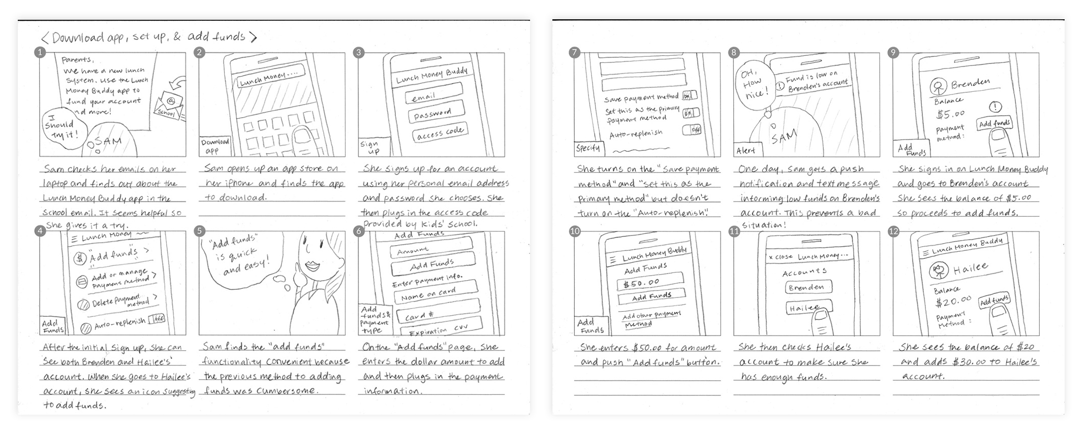
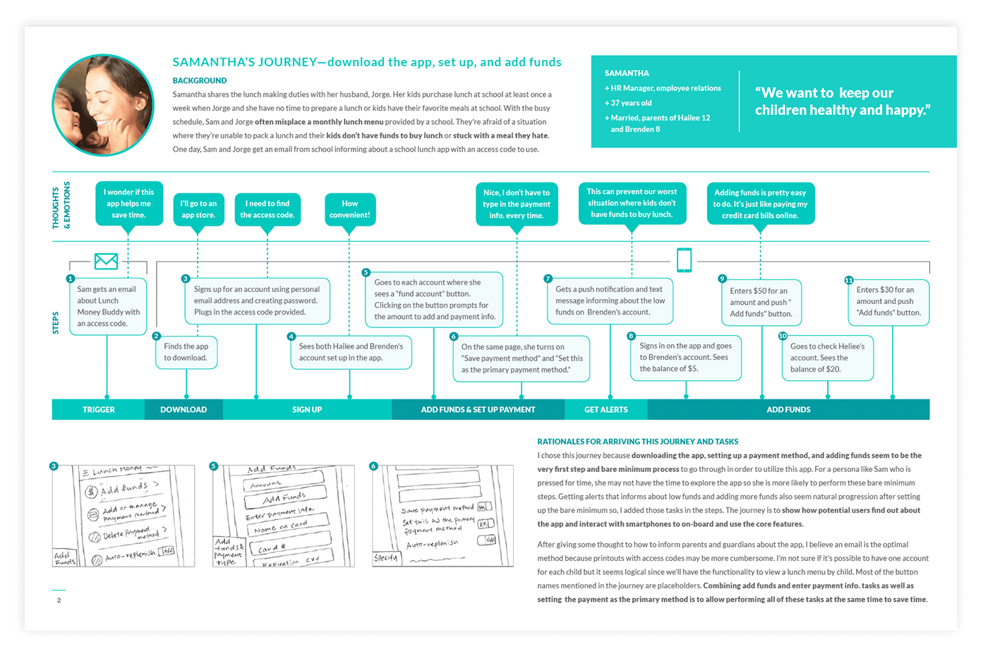
Story Boarding
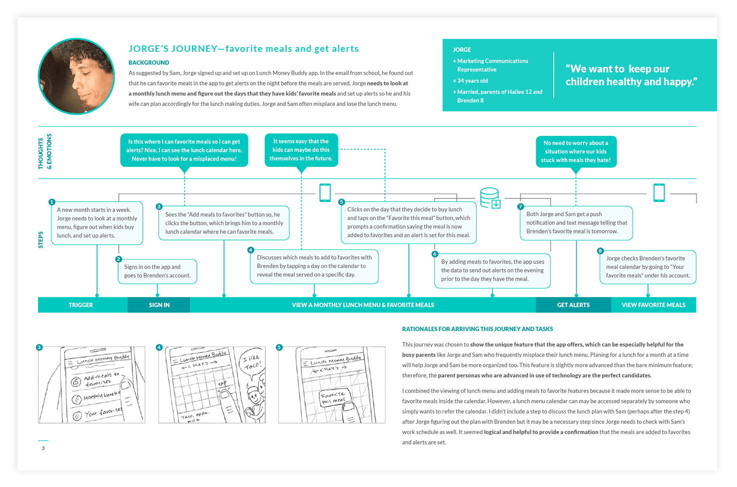
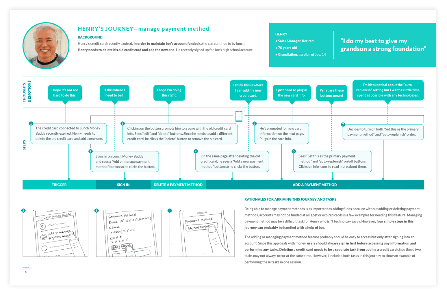
To understand user needs, contextualize the app, define functional requirements, and inform user flows, I created storyboards illustrating various user scenarios. This process allowed me to visualize how and when users would interact with the app, aiding in the design of intuitive and efficient user experiences.
I chose to illustrate the user flow from onboarding to adding funds, as it's the minimum yet most critical user flow. This initial interaction sets the tone for the user's emotional connection and trust in the app.
Establishing User Journeys
I translated the storyboards into four finalized user journeys, which helped identify content and functionality requirements as well as screen flows. Here are the final four journeys:
- Download → Set Up → add funds
- Favorite Lunch → Get Lunch Alerts
- Manage Payment Methods
Generating Sitemap
I meticulously developed a sitemap that aligns content organization and navigation structure with user personas, defined user and screen flows, and features identified through user journey mapping.
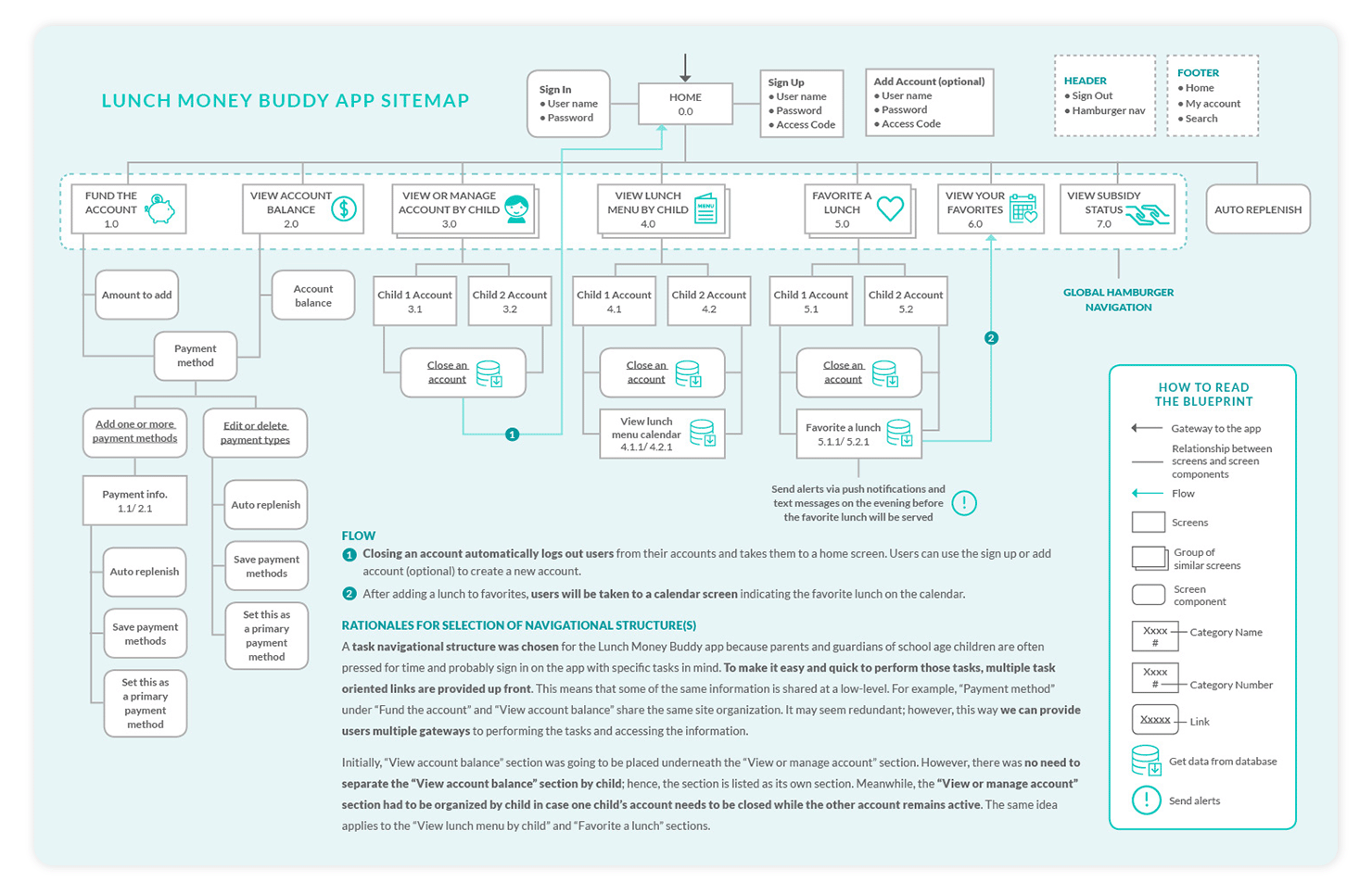
Features to Add
Here are the features I decided to add.
- Download the app from the Android or Apple app stores
- Sign up for an account
- Add funds
- Add multiple payment methods
- Select a primary payment method
- Change a payment method
- Delete a payment method
- Set up auto-replenish order
- View account balance
- View school lunch menu by child
- Favorite a lunch
- View subsidy status
Ideate
Building upon the user journeys and sitemap developed in earlier steps, I began exploring design solutions.
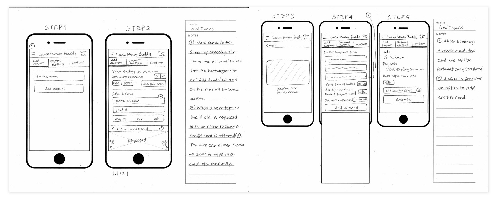
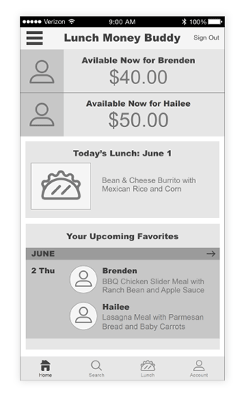
Generating Wireframes
I developed a series of wireframes for various tasks. Below is a wireframe series illustrating the screen flows for the onboarding-to-funding process.
Prototyping and Testing
To test the design and screen flows for various tasks, I developed a prototype using Proto.io. This prototype implemented the basic functionality and interactions required to navigate through the app, enabling testing of the UI, screen flows, navigation system, and content.
After conducting usability tests with fellow designers, I refined the design based on feedback. Complex screens were simplified into multiple steps with clear interactions and feedback cues. Color coding was introduced to guide users effectively.
User flows were adjusted to align with user expectations and mental models, and ambiguous labels were revised to enhance usability.
Final Solution
Following usability testing sessions, I updated screens and flows to enhance usability and address previously unrecognized issues.
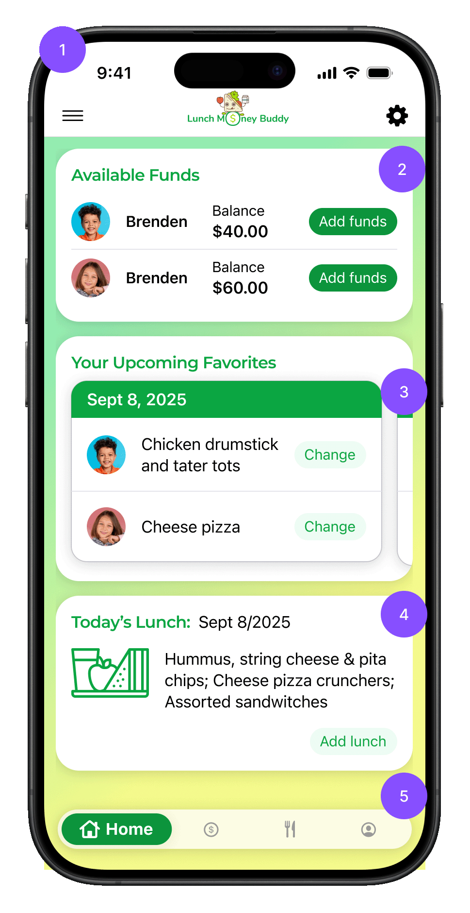
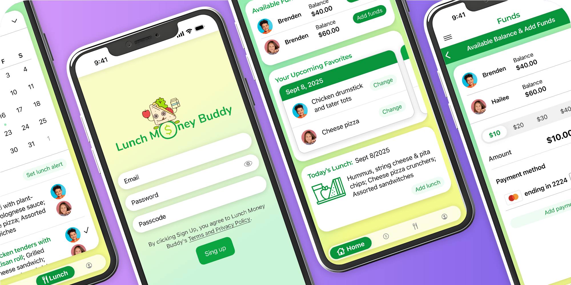
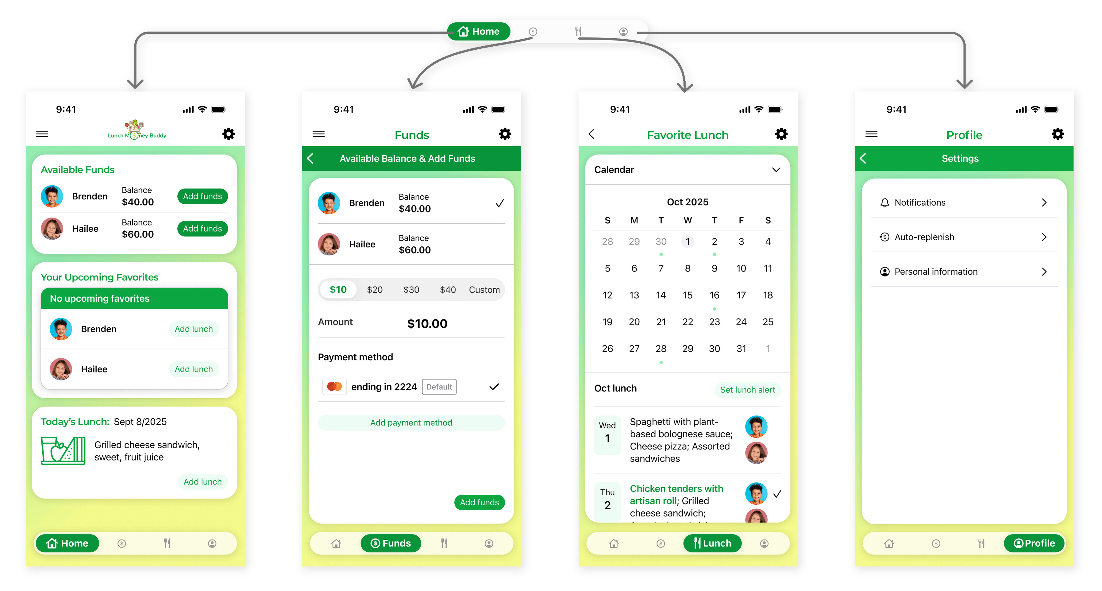
Home Screen
- The home screen provides an overview of the app, offering multiple access points for busy parents and guardian personas to perform tasks quickly.
- To address the pain point of not knowing lunch account balances, I exposed each child’s available balance on the home screen. When a balance is low, users can tap the “Add Funds” button for that child to navigate directly to the add-funds screen.
- To help parents plan lunches in advance, I surfaced upcoming favorite lunches on the home screen and added a button for quickly adding, adjusting, or removing lunches.
- To solve the issue of limited access to the lunch menu, I added a “Today’s Lunch” card on the home screen, allowing users to view that day’s menu and add a lunch via a CTA button in the card. Additionally, users can access the lunch menu directly by tapping the "Lunch" button on the global navigation.
- From the global navigation, users can easily access all core features.
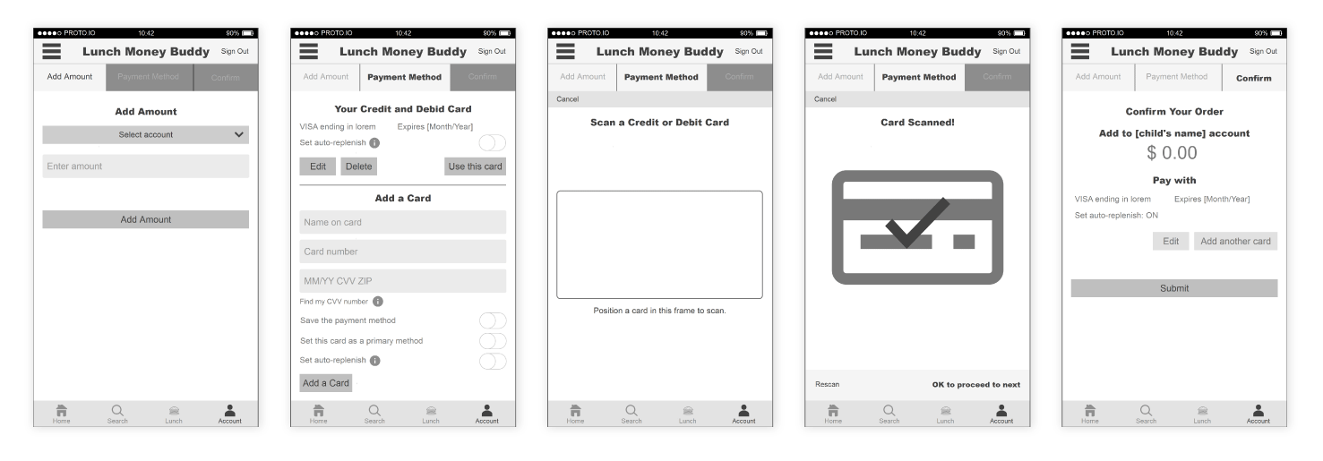
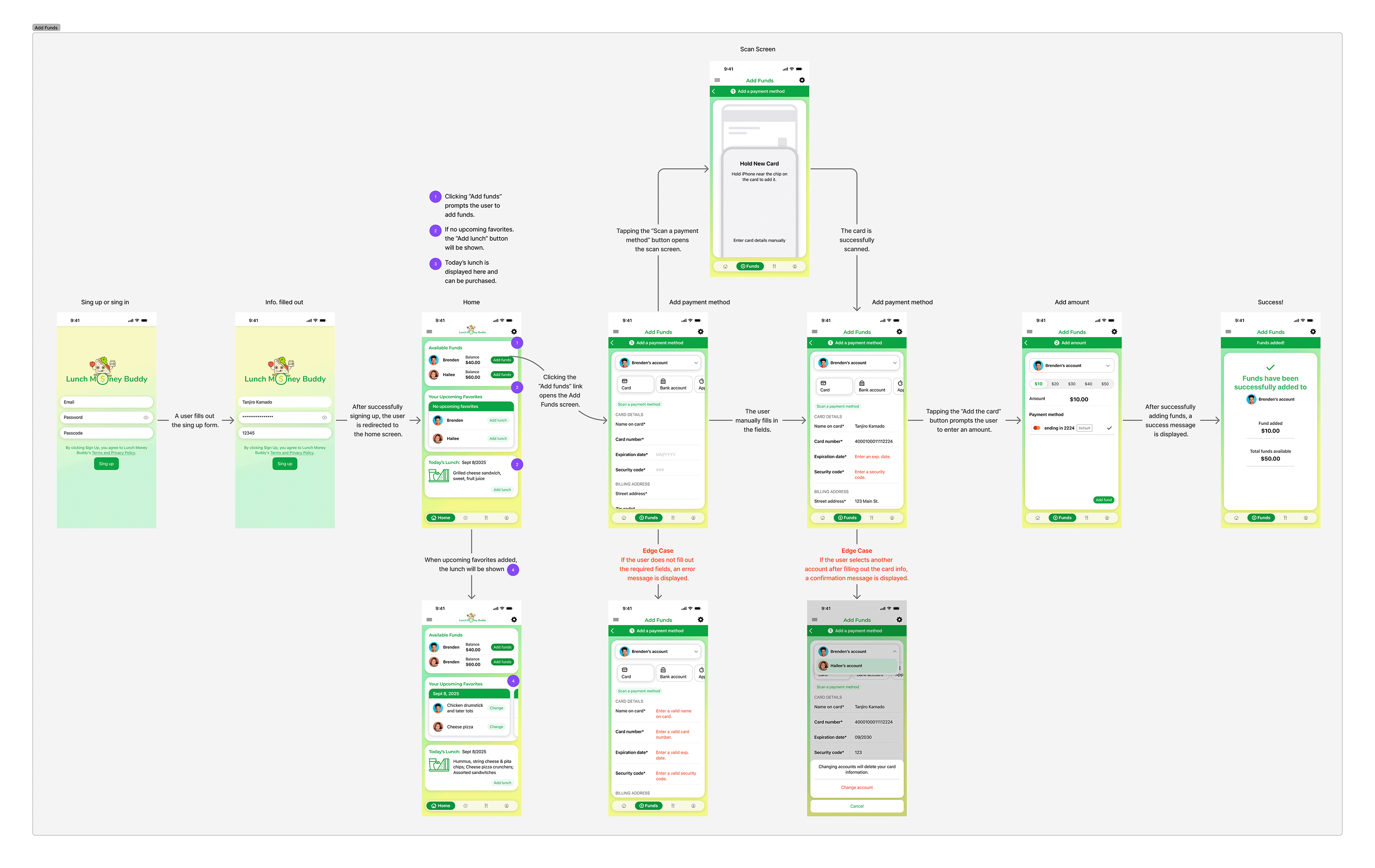
Add Funds Screen Flows
ToI intentionally streamlined the Add Funds user flow to support users’ primary goal — mitigating negative lunch account balances. To reduce manual entry and minimize errors, I added a card scan feature that auto-fills card information. Users can choose which account to fund via a dropdown menu, avoiding extra screens. Preset amounts allow quick selection, though users may also enter a custom amount if needed. For edge cases (such as changing the account after entering card data), a confirmation popup gives users the option to proceed or cancel the request.
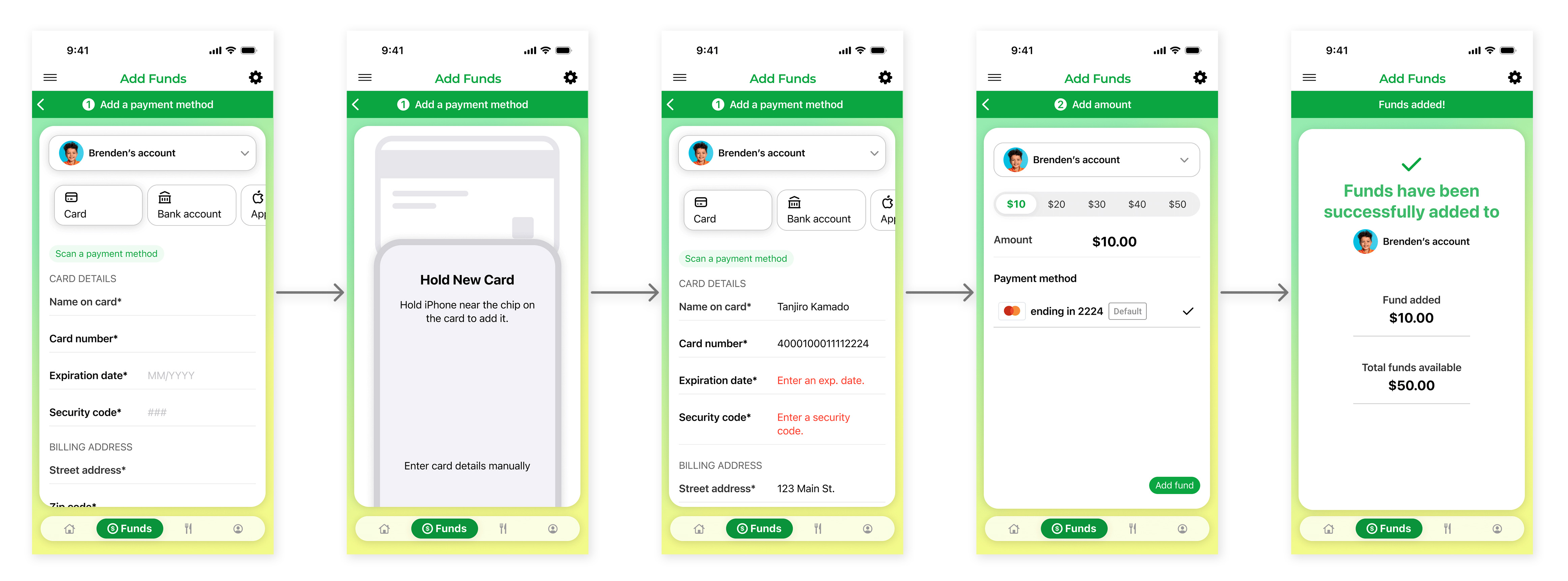
Add Funds – Full Screen Flows
The flows show the complete screens, including edge cases, from onboarding through adding funds in the app.
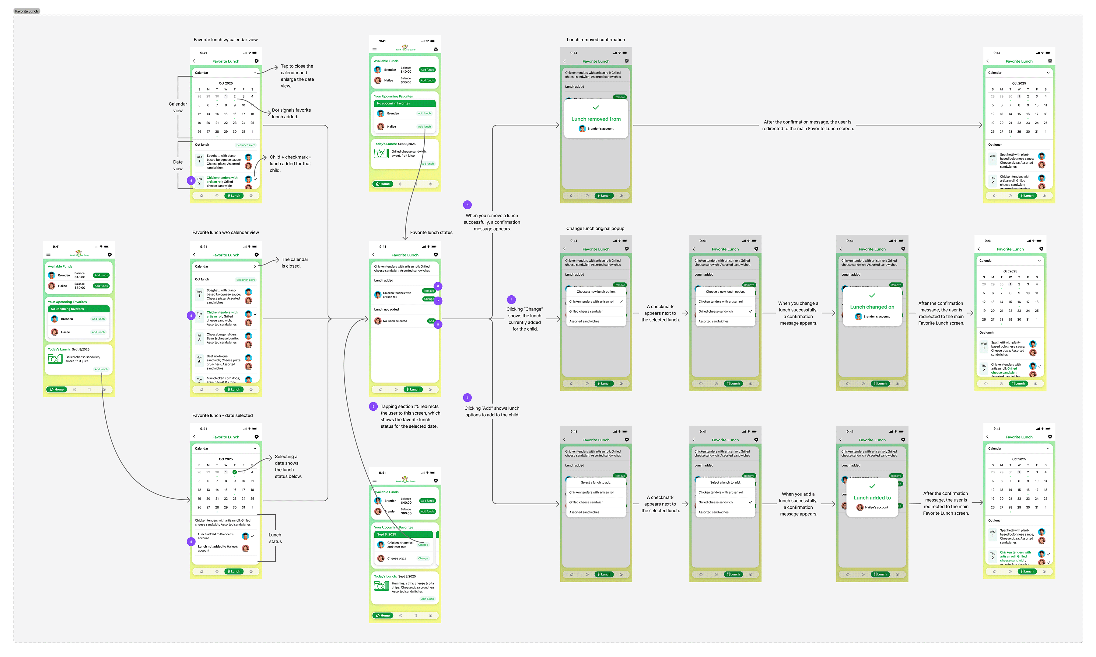
Favorite Lunch Screen Flows
To make lunch planning more convenient, I added direct access to “Order Lunch / Favorites” from the global navigation. Designing the Favorite Lunches screen was especially challenging because it needed to present dense information while staying simple. I added a monthly calendar to display the preordered lunches, but the lunch menu details ended up buried at the bottom, forcing excessive vertical scrolling. To solve this, I added a chevron icon near the calendar to collapse it. Tapping a date lets users add, change, or remove a lunch.
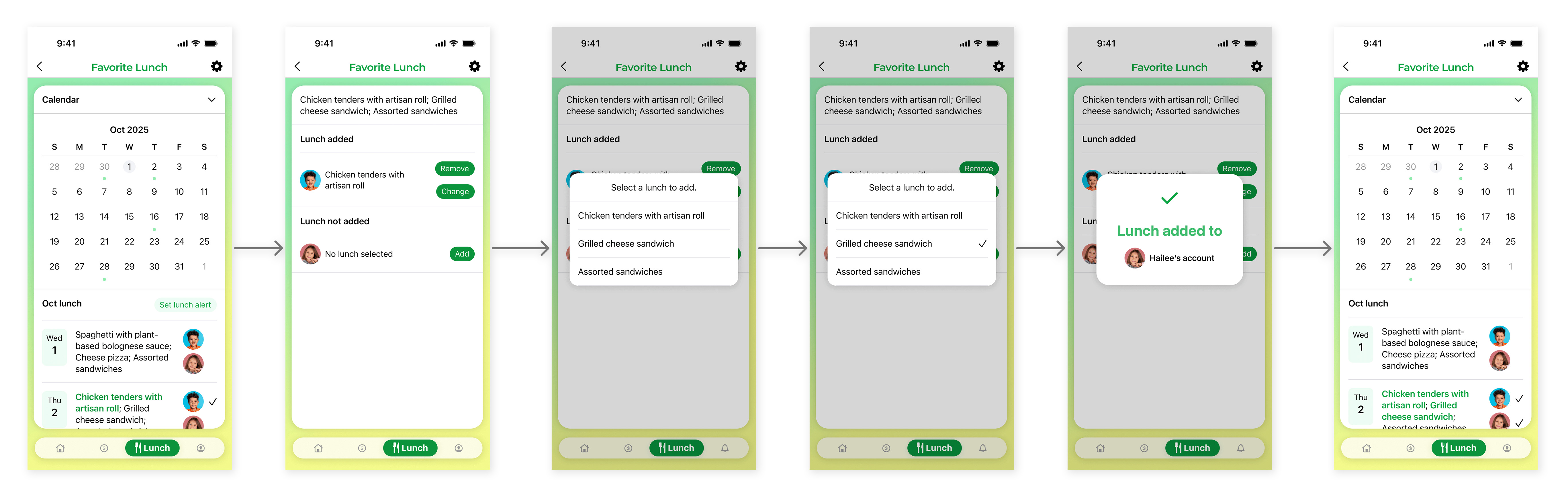
Favorite Lunch – Full Screen Flows
The flows illustrate the full experience — from home to adding, changing, and removing a lunch in the app.
Manage Payment Methods Screen Flows
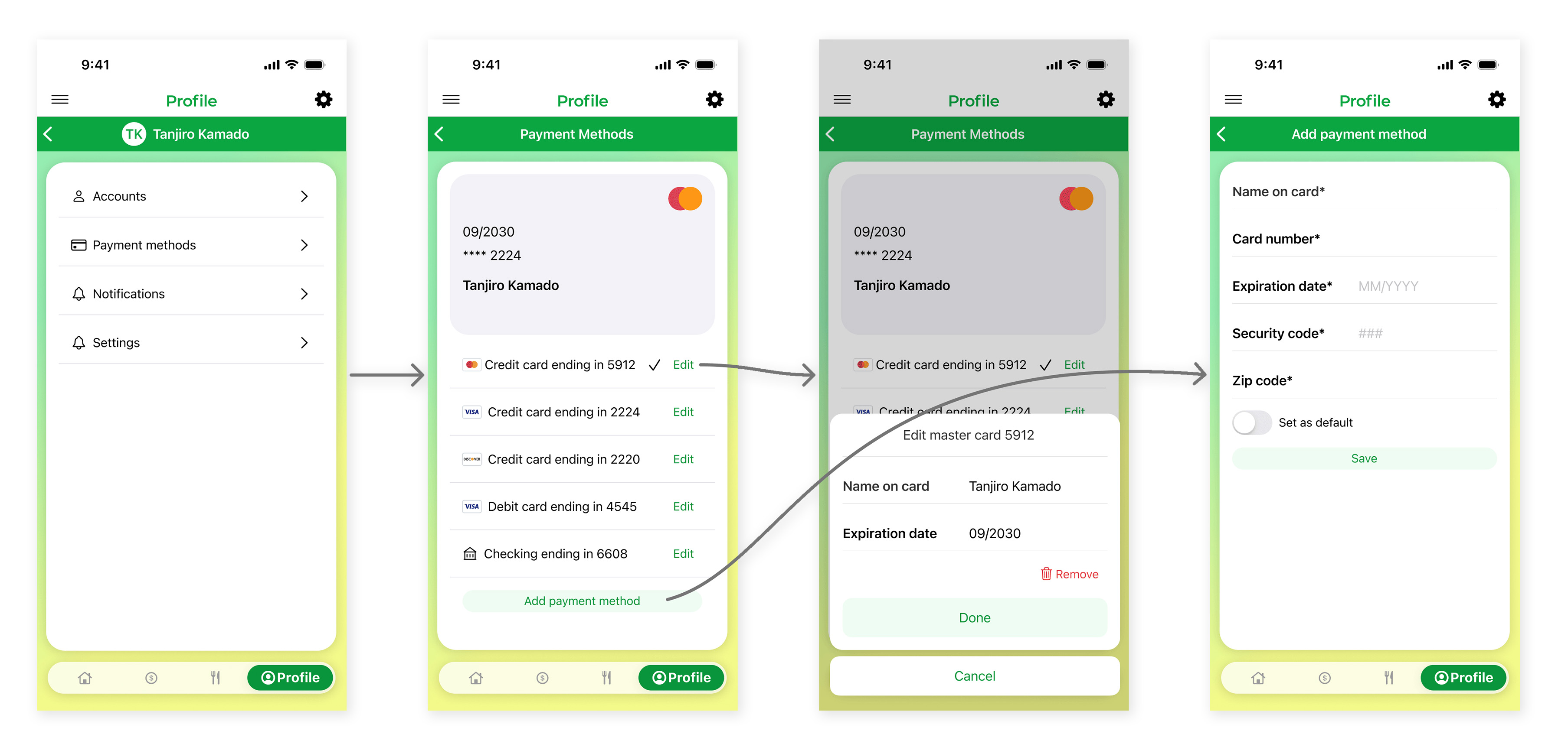
I added a Payment Methods section under the Profile screen, aligning with the user’s mental model. For editing an existing payment method, I used a popup modal, while for adding a new method, I opted for a full-screen view to clearly distinguish between the two interactions.
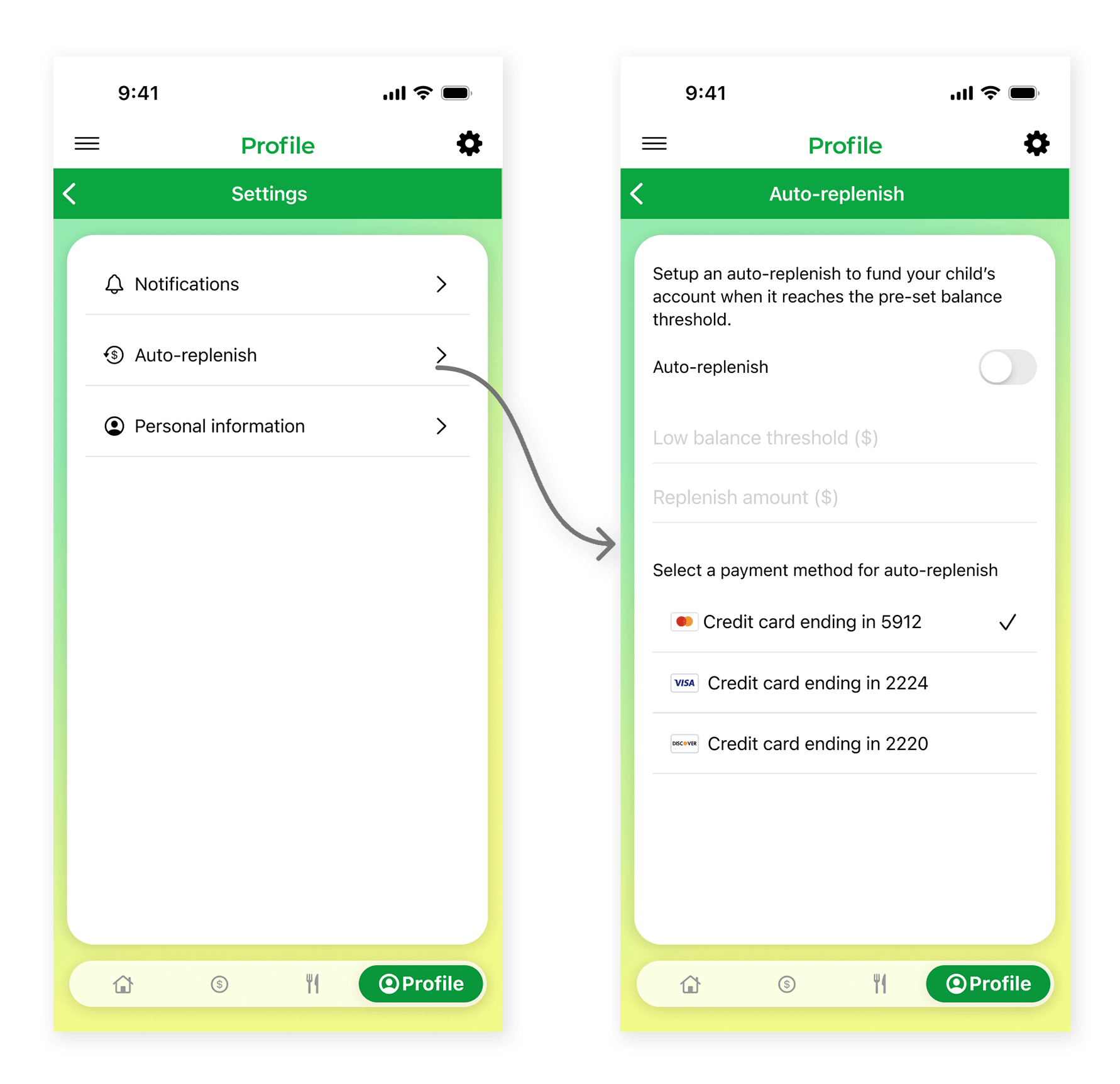
Auto-Replenish Screen Flows
The original requirements included a chart showing invoices processed per month by specific users. However, we realized that this metric could give misleading insights. For example, a clerk who enters many invoices will obviously show higher volume than an approver, skewing comparisons. To improve accuracy, we redesigned the visualization to break down invoice processing by action type (e.g., add, review, pay) so users can see meaningful comparisons across roles rather than just raw volume.One of the app’s most important features—maintaining funds in a child’s lunch account—is implemented as the “Auto-Replenish” option under the Profile → Auto-Replenish section. Users set a low balance threshold ($), which triggers the system to add funds once the balance reaches that amount. They also specify the replenish amount ($), which is the value automatically added when the threshold is hit.
Global Navigation
I made most of the main features accessible via the global navigation, making it easy to use regardless of the user’s technical skill level.
Next Step
The next step is to test the prototype with users and fine-tune the app.
