Accounts Payable Dashboard
Designing a real-time, centralized tool delivering company’s performance insights and enabling rapid resolution of AP processing bottlenecks.
Overview
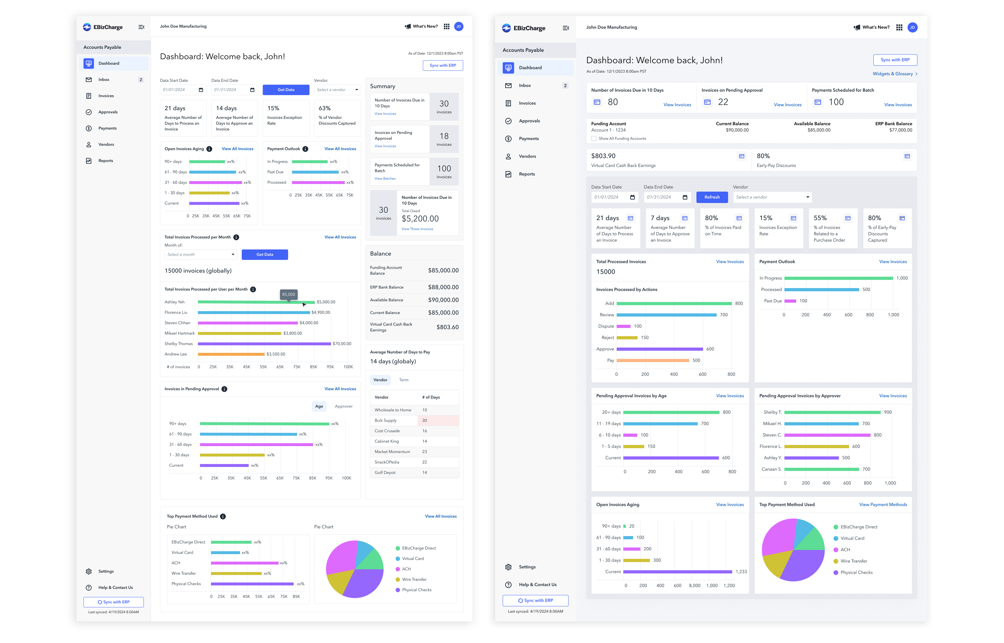
As the company expanded into the accounts payable (AP) field, I was tasked with designing a comprehensive dashboard that serves as the platform’s homepage. I began as a solo designer but later brought on two additional designers as the project proved to be more complex than expected. We received initial requirements in Jira along with a stakeholder-provided mockup to kick off the project.
Our design team met weekly to discuss requirements and share ideas. We also worked with the stakeholder, project owner, and developer to choose tools, understand constraints, and negotiate requirements together.
The challenge
Company Goals
To make the new AP product compelling, the business identified a dashboard as an essential feature. Here are the business goals for that dashboard:
- Offer a centralized view of key performance metrics and visualizations
- Reduce time spent spotting bottlenecks
- Enable faster, more informed decision-making
User Pain Points
While we refrained from conducting upfront user interviews due to time constraints, a resource such as a Stampli article revealed several key pain points:
- Overwhelming complexity & lack of visibility
Users struggle to understand overall AP performance at a glance because important metrics are scattered or hidden in multiple places. - Lack of a centralized performance overview
Users lack a single unified view of AP performance - everything from invoice processing time, cash flow, invoices processed per FTE, discount captured, and aging. - Difficulty in benchmarking & historical insights
Understanding trends over time - like whether AP cycle times are improving or degrading - is difficult because historical data and comparisons are not easily accessible.
Action
Identifying Users and Understanding Data Usage
As the sole designer at the start of this project, I began by understanding who the users were and how the dashboard data would be used. Online research revealed three primary user groups:
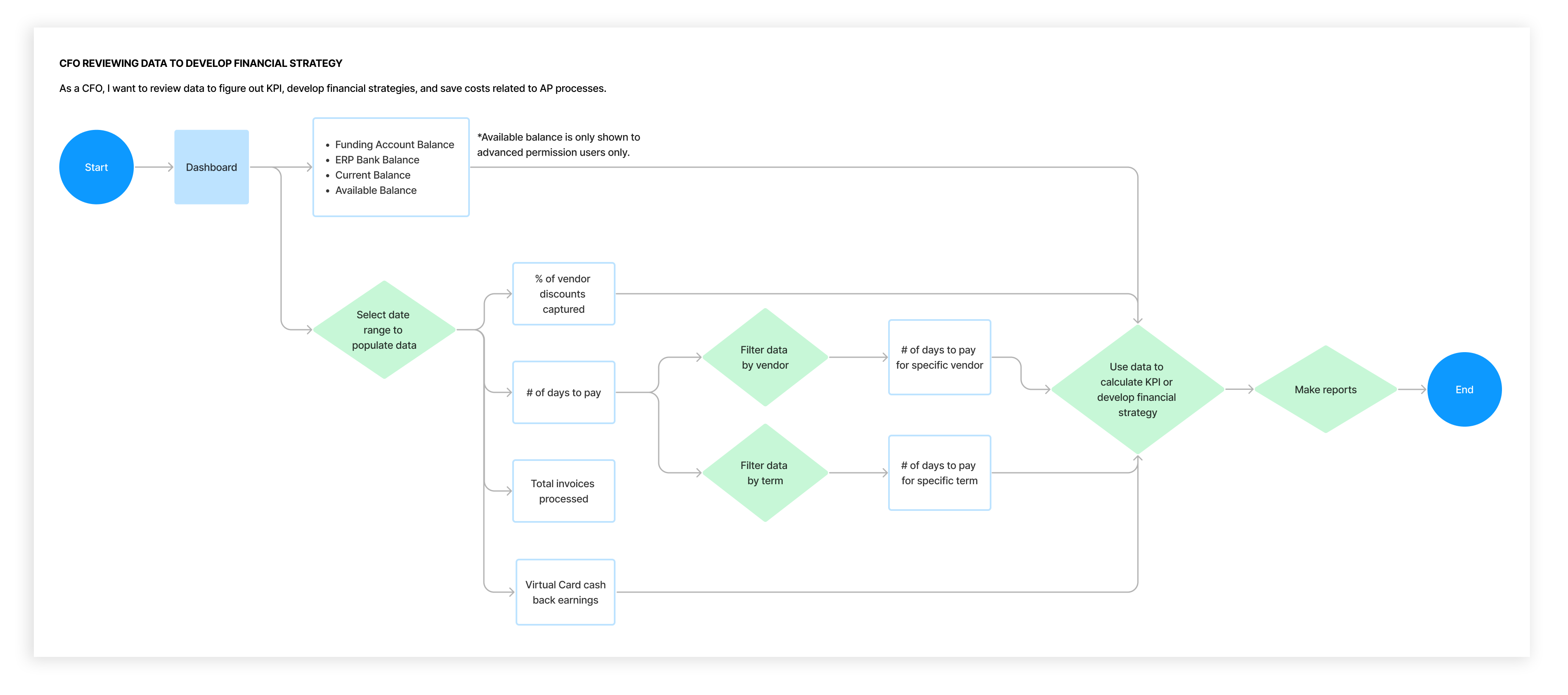
- CFOs – responsible for developing financial strategies
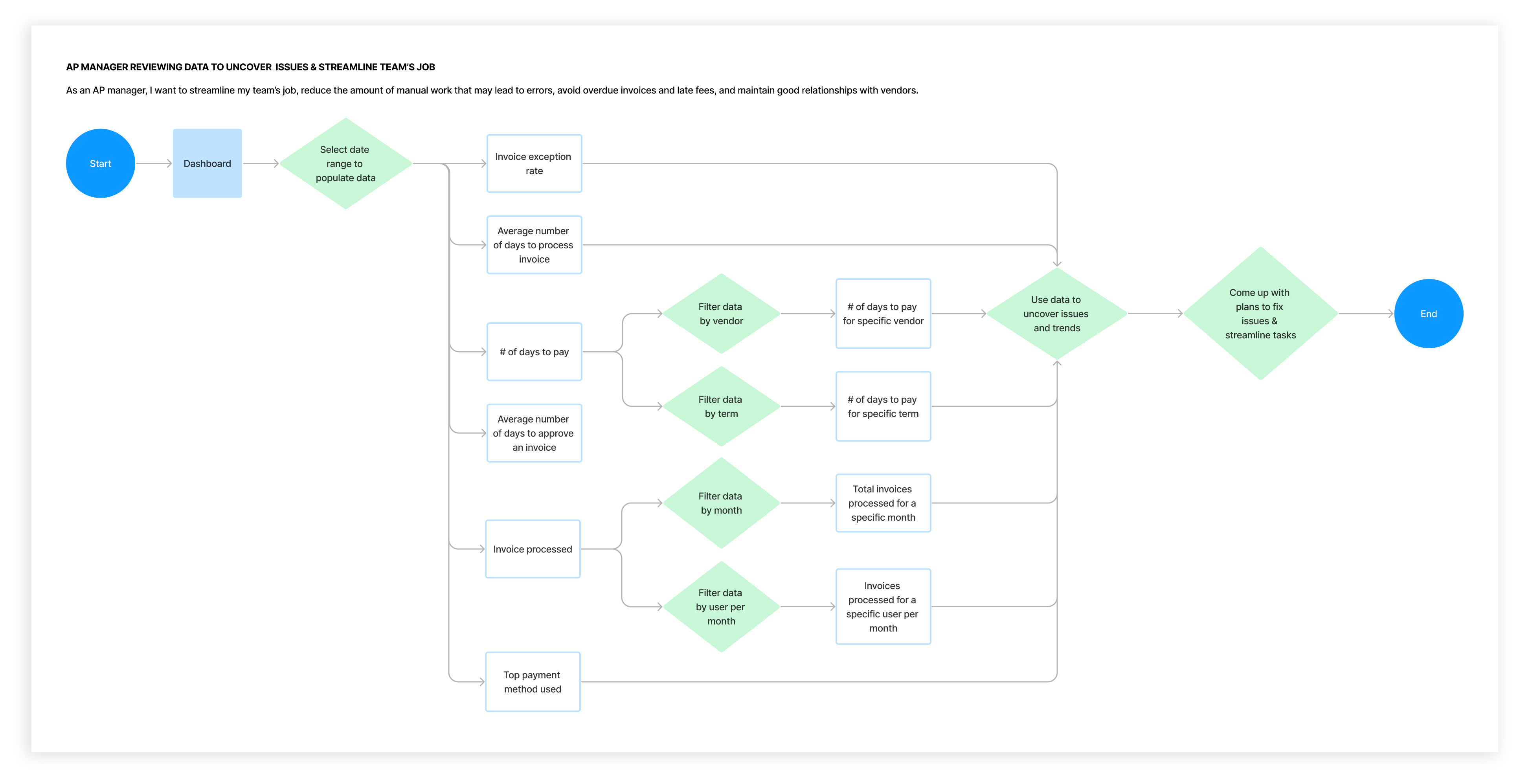
- AP Managers – focused on streamlining team workflows
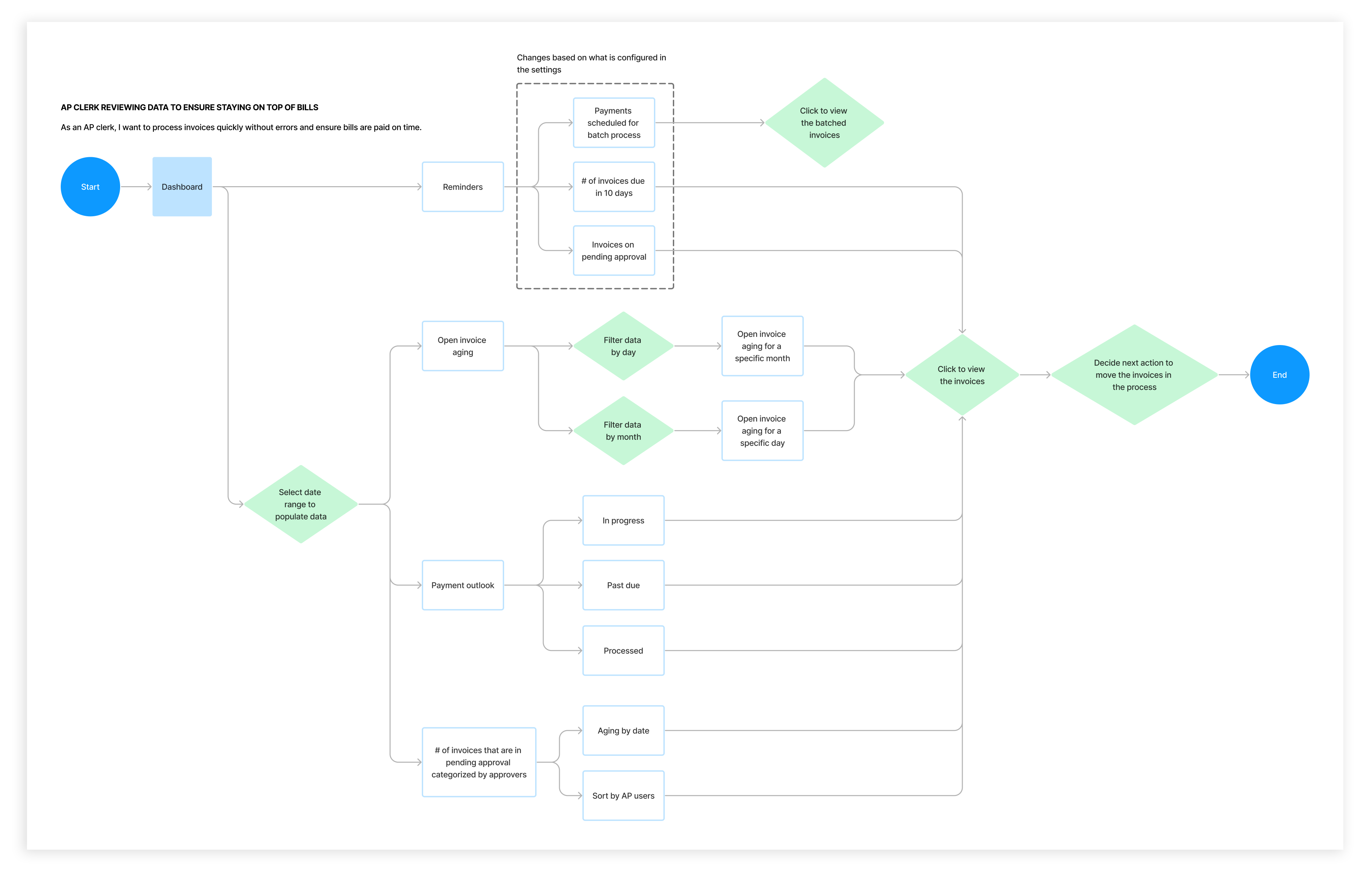
- AP Clerks – tasked with processing invoices
Using the requirements and stakeholder mockup information, I explored how each user group would interact with the dashboard data, which helped me understand the varying relevance of specific data. For example, “Number of Days to Pay an Invoice” might be valuable for CFOs and AP Managers but less relevant for AP Clerks.
Defining Questions
After two designers joined me for this project, we defined questions to solve.
- How might we make the dashboard relevant to all users?
- How might we design the dashboard so it reveals bottlenecks and allows users to dig deeper into issues?
- How might we build the dashboard to provide trends and forecasts so users can continuously refine their workflows?
Ideate
We begin exploring solutions, aiming to address these questions.
Encountering Issues
As we began to explore ideas, we faced some issues with the stakeholder-provided mockup:
- The date range filter was incompatible with some data visualizations.
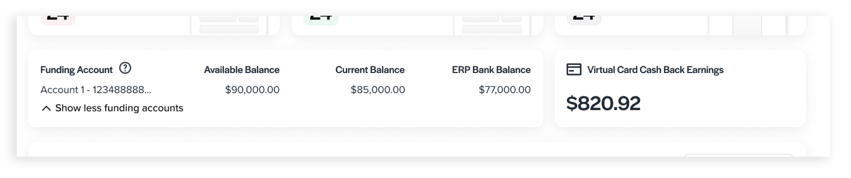
- Funding account and balance information is visible to all users.
- Lacks a data-visualization that shows trends and forecasts over time.
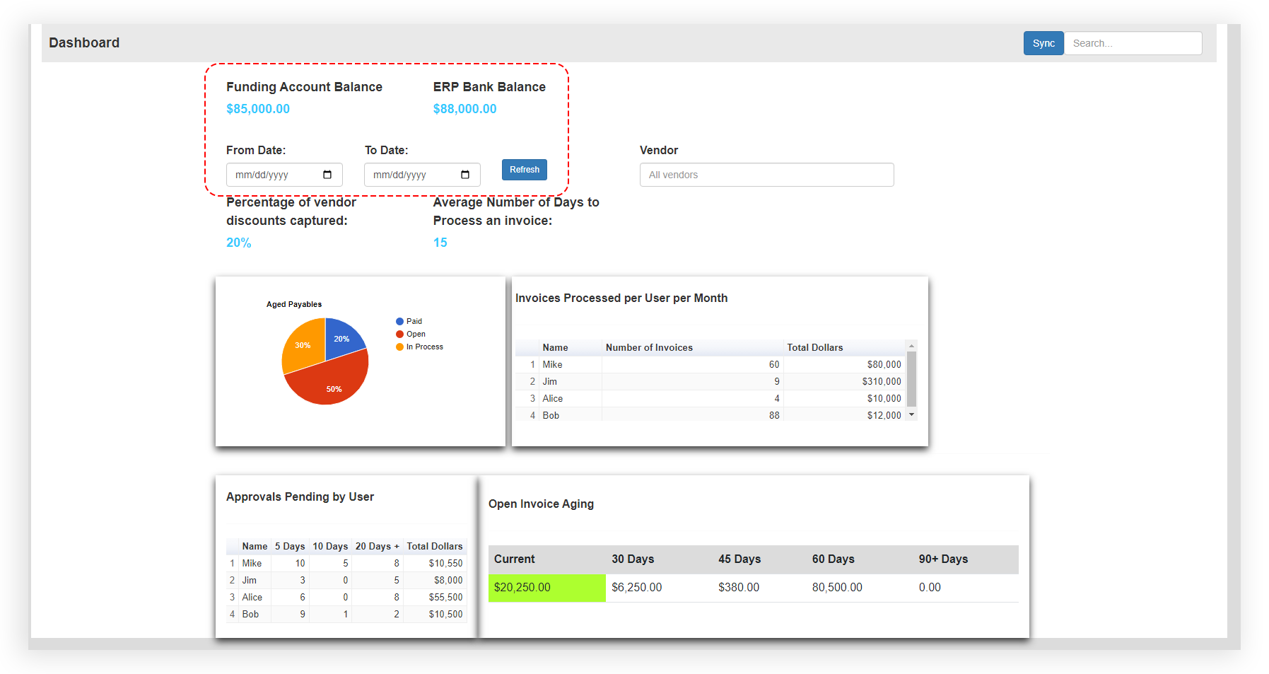
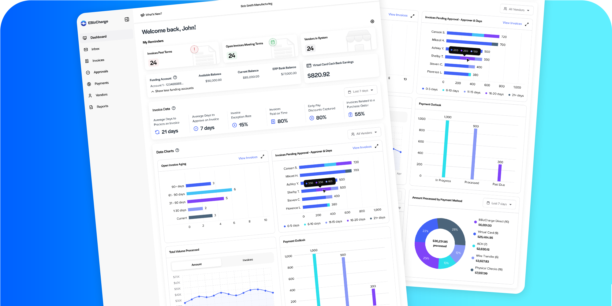
The original stakeholder’s mockup included date range and vendor filter systems, allowing users to filter data by any time range or vendor on the platform. However, metrics like “Average Days to Process an Invoice” couldn’t be accurately calculated for single-day ranges, and vendor filters often lacked sufficient data especially for metrics to display meaningful insights. We also realized that funding account and balance information were visible to all users, raising potential privacy concerns. Additionally, a graph to display trends and forecast over time is missing.
Aligning Requirements to User Needs
After negotiating with the stakeholder, we developed an alternative solution for the date range filter and decided to remove the vendor filter for metrics. We also restricted funding and balance visibility based on user type and added a data-visualization to show trends over time.
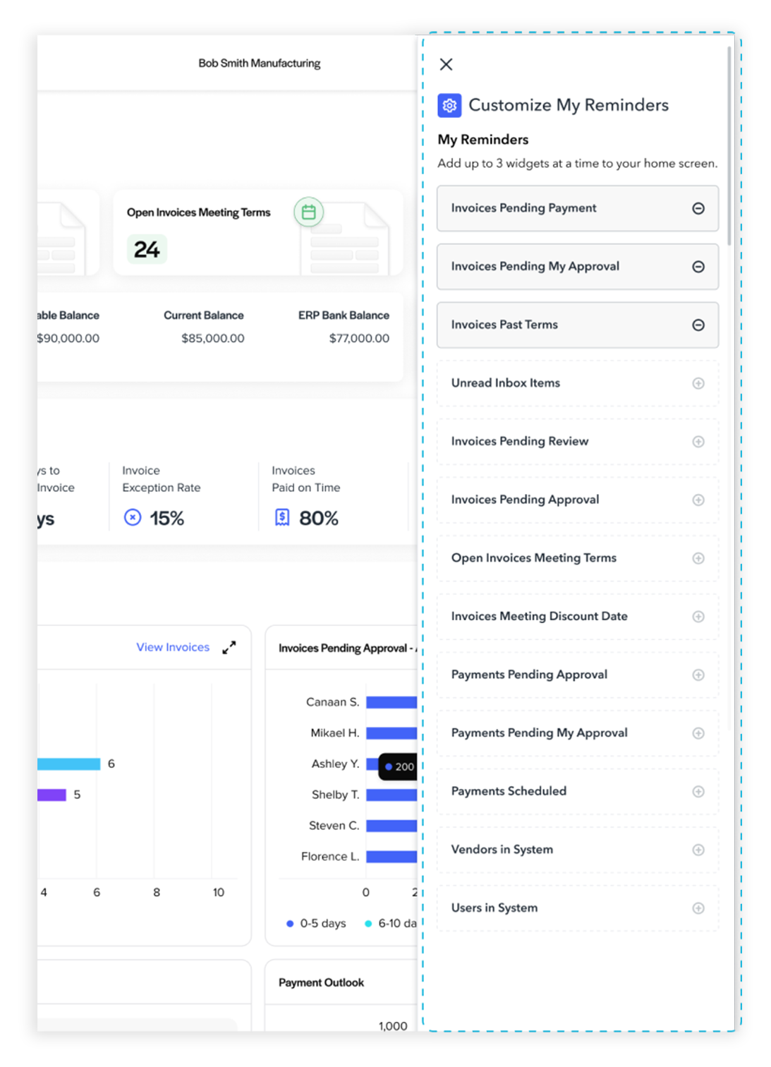
Though metrics like “% of Vendor Discounts Captured” and “Invoices Exception Rate” occupied prime real estate at the top of the dashboard, they weren’t relevant to all user types. So, we explored custom reminders - letting users choose which reminders appear at the top of the dashboard. The challenge then became, how could reminders adapt based on user roles?
We revisited our original user groups and mapped them to permission-based roles. For example, Approvers, Payers, and Admins align with AP Manager responsibilities, while Clerks and Accountants align more closely with AP Clerk duties. CFOs typically use the dashboard to view high-level trends (discount utilization, cash flow trajectories) - but they don’t usually require prompts or reminders to act.
We also explored merging related visualizations to make the dashboard more focused and actionable for users.
Final Solution
Prototype
1. Filter Incompatibility
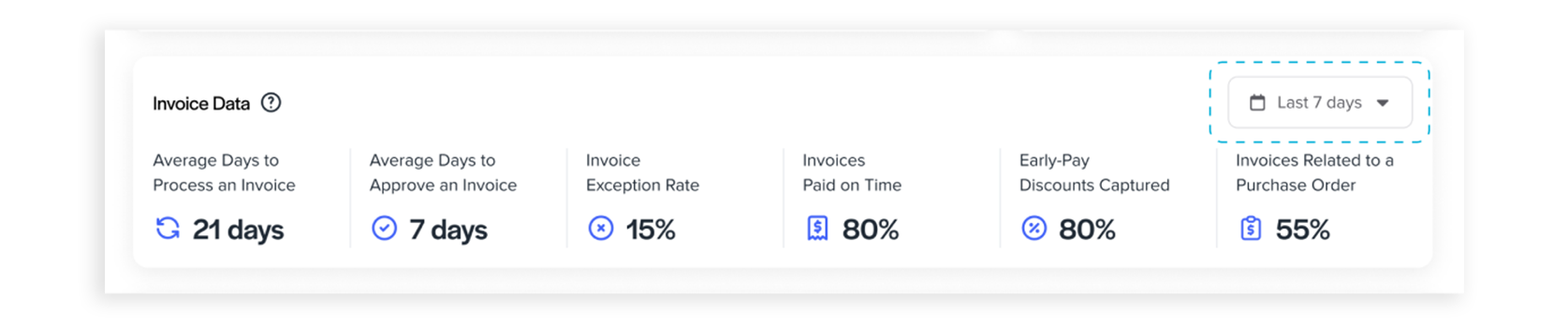
To address the limitations of the flexible date range filter and enhance data accuracy, we replaced it with a simplified period selector (e.g., “Last 7 Days”) and removed the vendor filter for metrics. This change ensures consistent data insights and reduces user errors, such as applying average metrics to single-day ranges.
2. Irrelevant Content
To address “How might we make the dashboard relevant to all users?” we introduced a Custom Reminders module that displays up to three role-specific reminders. Roles are mapped to permission levels such as Admin, Approver, Payer, and Clerk/Accountant. We implemented it as a widget that appears when the user clicks a gear icon near the “My Reminders” section. If a user disables all reminders, the widget section becomes hidden.
3. Information Architecture & Data Security
Initially, funding account and virtual card cashback earnings data were presented together and visible to all users. Recognizing that these datasets were unrelated and that unrestricted access posed security concerns, we separated the virtual card cashback data and restricted its visibility based on user permissions.
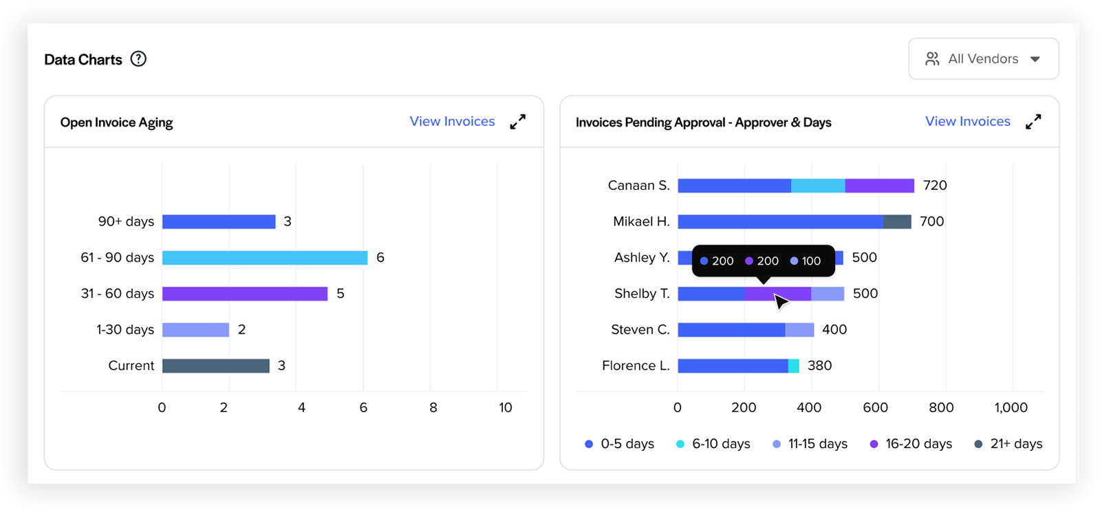
4. How might we design the dashboard so it reveals bottlenecks and allows users to dig deeper into issues?
To answer this, we added visualizations such as Open Invoice Aging and Invoices Pending Approval - Approver & Days. These charts help users spot bottlenecks—for example, invoices stuck in approval for an extended period by certain approvers—and then take action. Users can click a “View Invoices” link on the charts, which redirects them to the list of those invoices pending approval for closer inspection and processing. We also consolidated “Invoices in Pending Approval” and “Invoices Pending Approval by Approver” to “Invoices Pending Approval - Approver & Days” to deliver more data-rich insights.
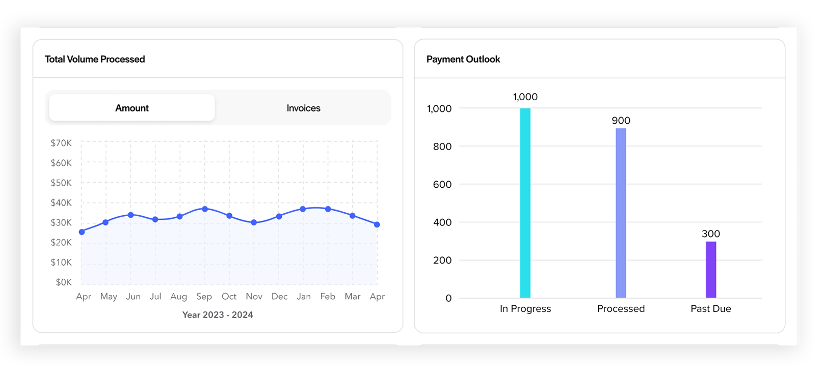
5. Difficulty in Understanding Trends Over Time & Forecasting
To address this, we added “Total Volume Processed (by Amount or Invoice Count)” and “Payment Outlook” visualizations.
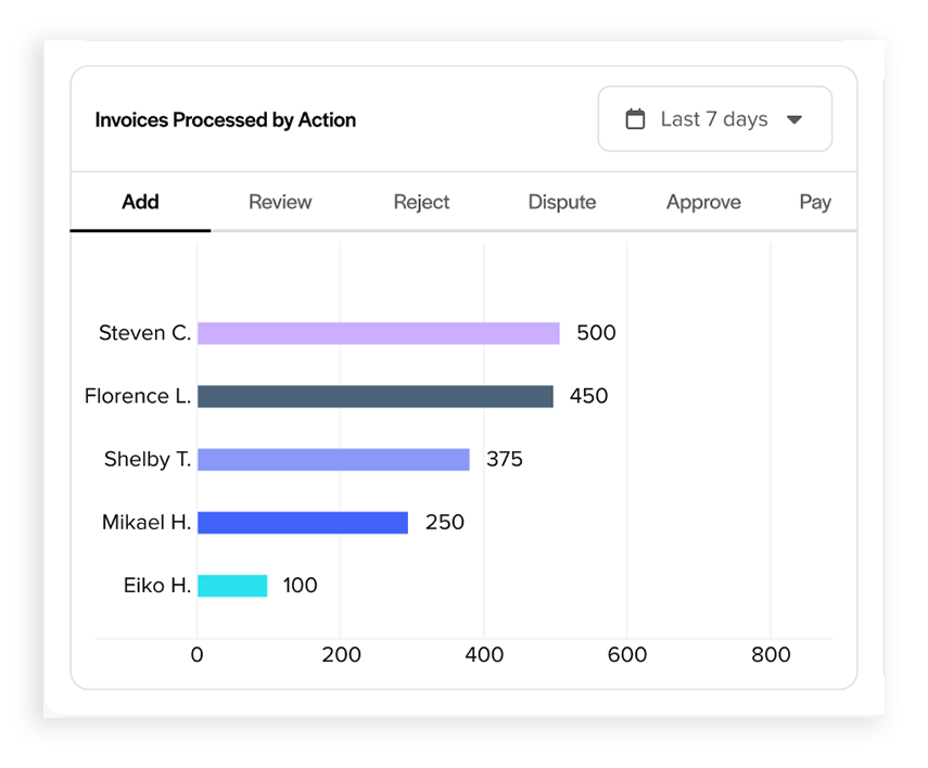
6. Dada Visualization Reliability Issue
The original requirements included a chart showing invoices processed per month by specific users. However, we realized that this metric could give misleading insights. For example, a clerk who enters many invoices will obviously show higher volume than an approver, skewing comparisons. To improve accuracy, we redesigned the visualization to break down invoice processing by action type (e.g., add, review, pay) so users can see meaningful comparisons across roles rather than just raw volume.
Outcome & Impact
- Reduced invoices pending over 11 days by ~20%.
- Cut open-invoice aging (61+ days) by ~15%.
Retrospective
Project expectations led me to overlook a crucial step: critically evaluating stakeholder content. I’ve learned that questioning requirements and aligning them with user needs is essential. Advocating for more time can help deliver better solutions.
